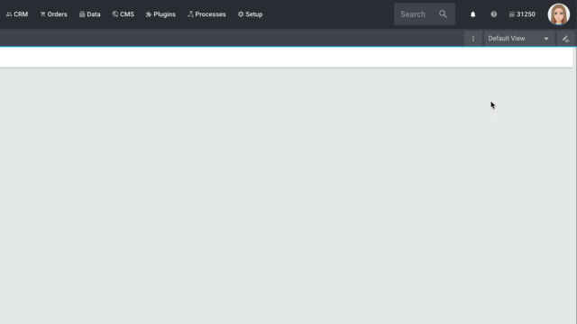
Customising a view
This page focuses on the product’s detail view in the back end and explains the basic concept of use. You’ll learn how to customise the product view so that it only includes the data fields that are relevant for your company.
|
Do you have admin rights?
Only admin users can create and edit views. If you are not an admin:
|
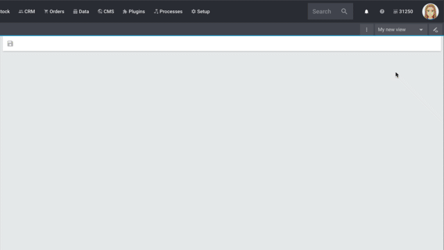
1. Creating a new view
-
Click on the list of views ().
-
Click on Create new preset ….
-
Enter a name.
-
Click on Create view.
→ The new view is created and opens automatically, i.e. it is applied. It’s now possible to switch between different views.
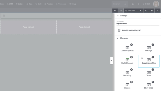
2. Creating a grid
-
Click on Edit view ().
-
Add rows and columns to create a grid.
-
Click on and then on Add row.
-
Click on Add column ().
-
Drag the columns to make them larger or smaller.
-
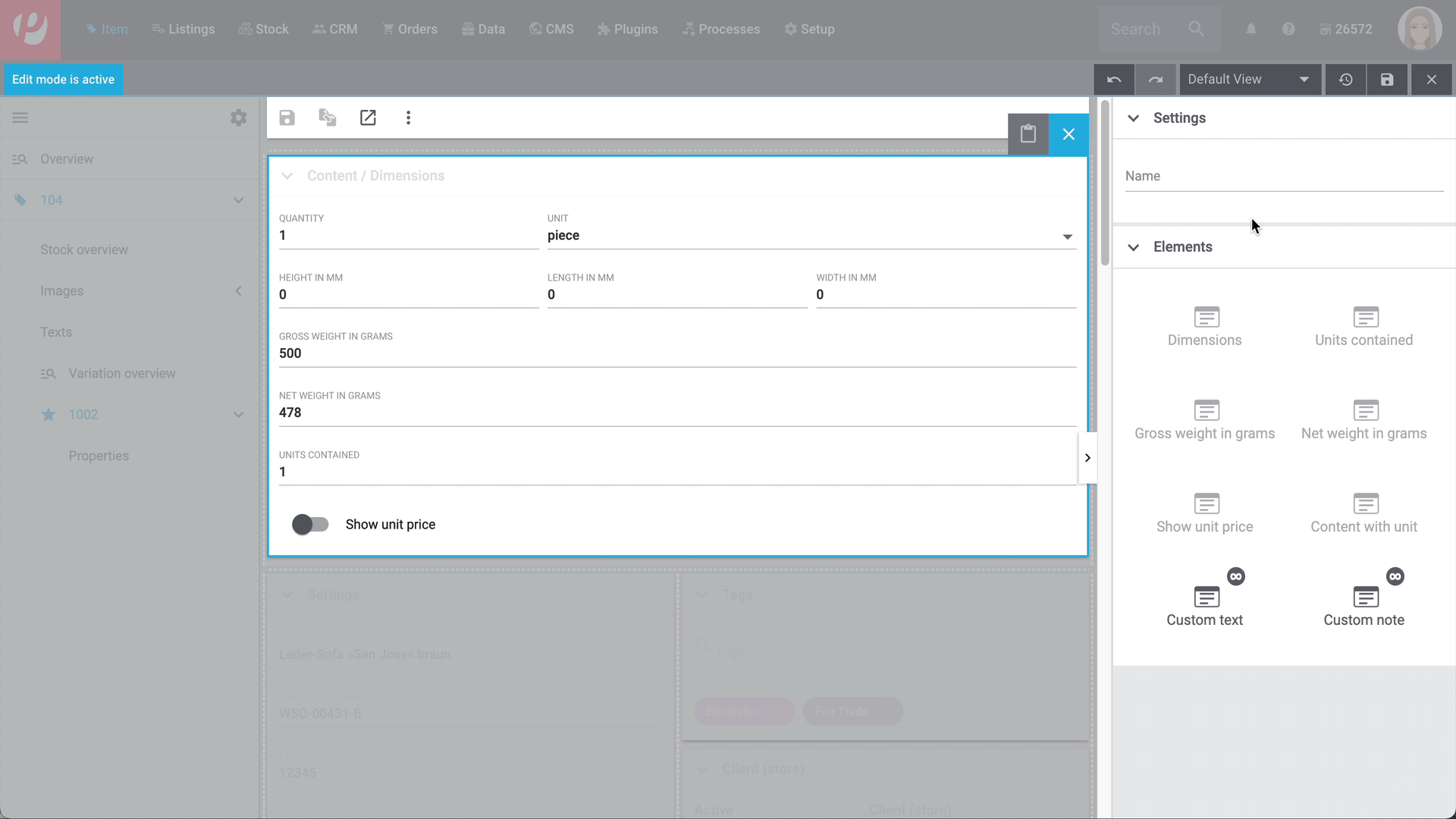
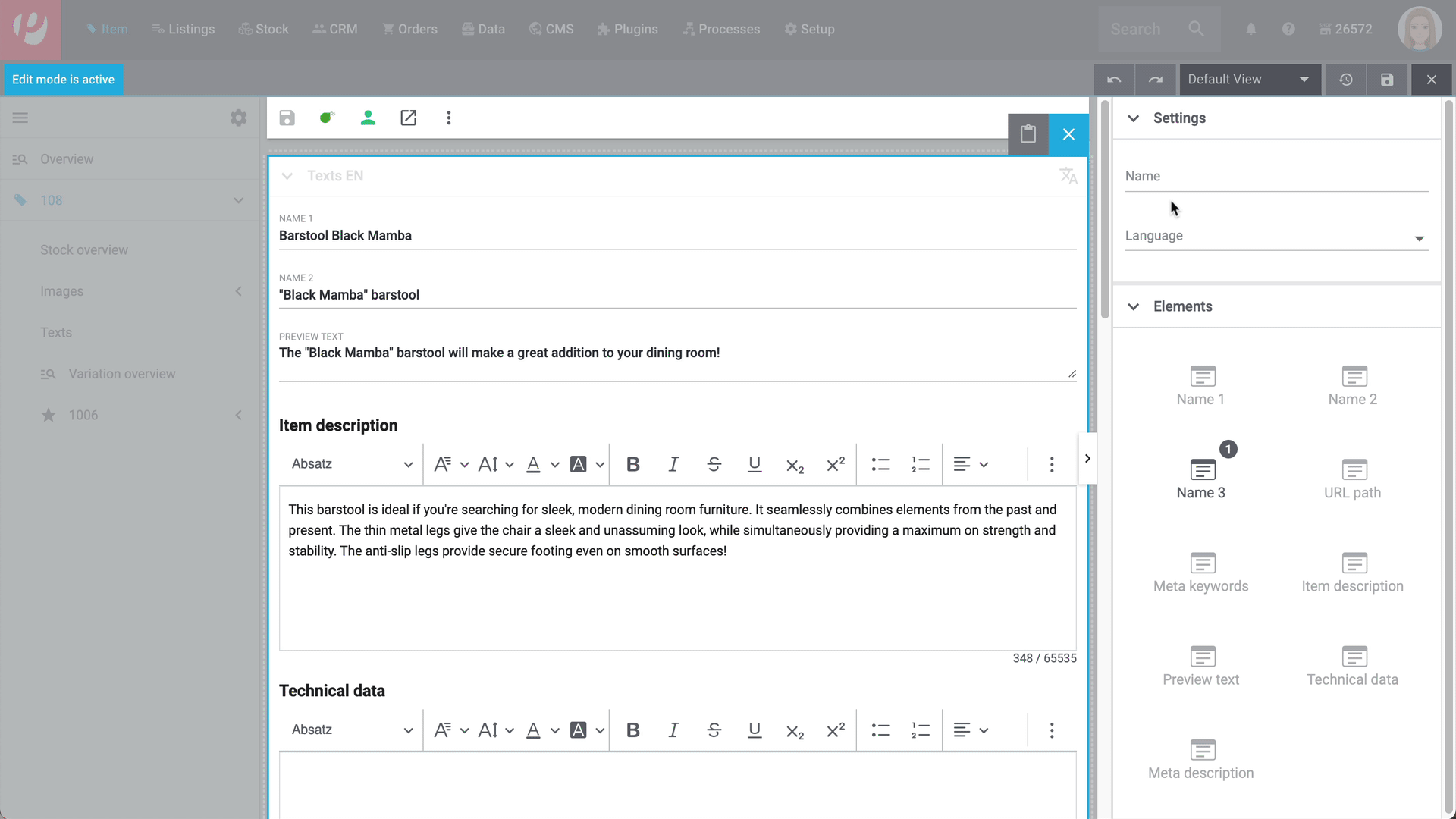
3. Placing elements
-
Add elements via drag & drop.
-
Click on and edit the element’s settings.
-
Change the name.
-
Decide which data fields the element should contain.
-
Use drag & drop to arrange the data fields in a specific order.
-
-
Click on
| Symbol | Explanation |
|---|---|
Leads down one level. |
|
delete |
Deletes the element. |
Leads up one level. |
|
Can I add elements multiple times?
The number in the grey circle indicates how many times you can use the element.
|
4. Toolbar
The toolbars are customisable in the item and variation views. In other words, you can decide which information and buttons they should include.
-
Click on the name of the view.
→ A drop-down list opens. -
Click on Edit current view.
→ The editing mode opens. -
Move your cursor over the element Toolbar and click on to access the settings.
or: Add the element Toolbar via drag & drop. Position it at the top of the view. -
Carry out the settings according to [toolbar-settings].
-
Save () the view.
| Setting | Explanation |
|---|---|
Display header |
Decide, if the header above the tool bar should be displayed. If the header isn’t displayed, the name as well as item ID and sub header are omitted. |
Display sub header |
Decide, if the sub header above the tool bar should be displayed. If the sub header isn’t displayed, information about the creation date, change date and the item type/ variation type is omitted. |
Condensed |
If Condensed is activated, only the toolbar is displayed. |
Toolbar configuration |
In this drop-down menu you select which features are displayed in the toolbar. Available are: More options, Save, Flag 1, Flag 2, Labels, Item Preview, Reload, Copy Item, Delete Item, Item serial numbers, Create listings, Available listings und Active listings. By clicking you determine the order via drag-and-drop. |
Sub header configuration |
In this drop-down menu you select which information is displayed in the sub header. Available are: Last update, Created and Type. By clicking you determine the order via drag-and-drop. |
Item title |
Select which title should be displayed in the header. Available are: Item ID, Name 1, Name 2, Name 3 and Variation number of the main variation. |
5. Custom texts and mandatory fields
It’s possible to customise the design of an entire element or the design of a single data field.
You can customise the element level in the following ways:
| Setting | Explanation |
|---|---|
Name |
Gives the element a custom name. This is useful, e.g. if you work with custom portlets or if the pre-defined name is not specific enough. |
You can customise the data field level in the following ways:
| Setting | Explanation |
|---|---|
Element name |
Gives the data field a custom name. This is useful, e.g. if the pre-defined name is not specific enough. |
Display note |
Adds a note to the data field. The text is displayed underneath the data field and in a smaller font. |
Required |
Turns the data field into a mandatory field. This means that:
This is useful, e.g. if you want to require your employees to enter certain pieces of information. |
Can not be edited |
Modifies the data field so that it can no longer be edited. This is useful, e.g. if your employees should be able to see certain pieces of information, but not edit them. |
6. Own table columns, order and expansion/collapse
Some elements can be customised individually. For example: decide which columns are displayed in the table.
-
Click on the name of the view.
→ A drop-down list opens. -
Click on Edit current view.
→ The editing mode opens. -
Hover the cursor over an element and click to open the settings.
-
Open the drop-down list Table columns and select the columns () that should be displayed in the table.
-
Save (*) the view.
Some elements can be customised individually. For example: you decide which elements are collapsed or expanded per default.
-
Click on the name of the view.
→ A drop-down list opens. -
Click Edit current view .
→ The editing mode opens. -
Hover the cursor over an element and click to open the settings.
-
Activate or deactivate Expanded. This option manages if the elements should expanded or collapsed per default.
-
Save () the view.
7. Finalising your work
-
Save the view () and close the editing mode ().
-
Check the result in the main window.
-
If necessary:
-
Click on Edit current view to further edit the view.
-
Allow other users to see the view.
-

7.1. Functions in the editing mode
| Symbol | Explanation |
|---|---|
Saves the changes made to the view. |
|
undo |
Undoes the last change, unless this change has already been saved. |
redo |
Restores the previously undone change. |
Resets the view to the state that was last saved. |
|
Closes the editing mode. In case of unsaved changes, a dialogue is displayed. |
7.2. Granting rights
Which roles should be allowed to see the view? You can grant or limit access to every single view.
-
Click on the name of the view.
→ A drop-down list opens. -
Click on Edit current view .
→ The editing mode opens. -
Click on Rights management.
→ The menu Setup » Account management » Roles opens in a new tab. -
Search for () and open the appropriate user role.
-
Click on Role-defined views.
-
Expand the entries () and select () the views that the user role should have access to.
-
Save () the settings.
Further information about user accounts and access rights.
8. FAQ
Do you have admin rights? Only admin users can create and edit views. If you are not an admin:
-
Turn to someone with admin rights.
-
Ask them to create the necessary views and assign them to your user account.
Have you already created a view? The view controls which product information is displayed and how this information is arranged. In other words, you can design your item and variation pages however is most convenient for you. If you haven’t created a view yet or if the view is empty, then you won’t see any information.
The number in the grey circle indicates how many times you can use an element.
-
Most elements can only be added once.
-
The element Custom portlet can be added any number of times. However, the individual data fields within the portlet can not be added multiple times. Further information can be found in an example of use.
Yes, you can export/download every view and import/upload it to a different view.
Proceed as follows to download a view:
-
Open the menu where you want to download a view.
-
Click on the view name in the top right.
→ A dropdown menu with all views in the menu opens. -
Click on more_vert besides the view name you want to download.
→ A drop-down list opens. -
Click on more_vertDownload viewmore_vert (material:download).
→ The selected view set is downloaded as a json file.
Proceed as follows to upload a view:
-
Open the menu in which you want to upload the view.
-
Click on the view name in the top right.
→ A dropdown menu with all views in the menu opens. -
Click on Upload view (upload).
→ The Upload view window opens. -
Click on Select file(upload).
-
Select the .json file you want to upload.
Optional: The name of the selected view is automatically displayed in the Name field. You can change the name. -
Click Import.
→ The view is created under the given name.