Setting up the ShopBuilder (Legacy)
|
Successor to plentyShop LTS
The content on this manual page pertains to the old plentyShop LTS. |
ShopBuilder is PlentyONE. modular construction kit for quickly setting up your plentyShop LTS via drag-and-drop. You require no programming skills.
ShopBuilder consists of 2 user interfaces: the content manager and the editor. The content manager is the user interface in which you manage ShopBuilder categories and individual contents for these categories, e.g. for creating seasonal homepages. The editor is the view in which you design individual pages and carry out the settings of the widgets on your pages.
|
Requirements for the ShopBuilder
To use the ShopBuilder you need a valid SSL certificate. |
Assigning rights for back end users
To access all of ShopBuilder’s features, you require the following user rights:
Users with roles that are not of the type Administrator can only see certain sections and menus in PlentyONE. This means they only have limited access to the system. If employees edit ShopBuilder settings and pages, they need at least the following rights:
-
CMS
-
Plugins
-
Setup > Assistants
Note that only users with roles of the type Administrator can grant rights.
Assigning rights:
-
Open the menu Setup » Account management » Roles.
→ The roles overview opens. -
Click on New (add).
→ The role creation menu opens. -
Enter a name for the role.
-
Switch to the advanced mode by toggling Advanced (toggle_on) slider.
-
Assign the rights for the respective section by ticking the check boxes indicated above.
Note: You can either grant rights for complete sections or limit the rights you grant the user. To only grant limited rights in a certain section, expand the section. -
Save (save) the settings.
|
The simple mode and advanced mode are connected. If you check menu visibilities in the simple mode the corresponding permissions in the advanced mode will be checked automatically. The connection only exists in this direction. If you check permissions in the advanced mode no menu or plugin visibilities will be checked automatically. |
1. Shopbuilder’s content manager
The first thing you see when opening the Shop » ShopBuilder menu is the content manager of the ShopBuilder. This is where you manage categories and add new contents. A content is an online shop page you design. In the category view you can create, copy, and delete contents. Below, you’ll find an overview of the features of ShopBuilder’s content manager.
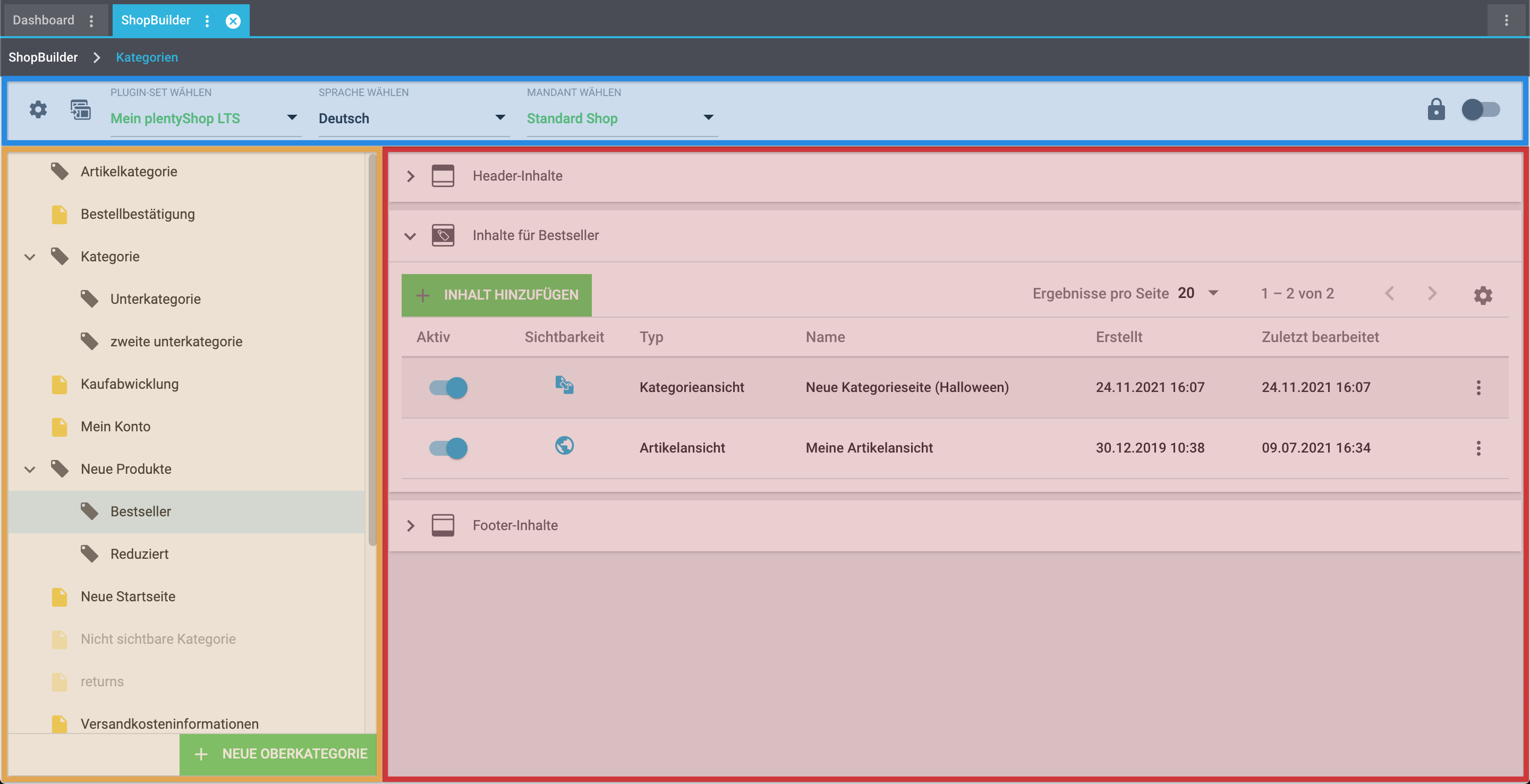
-
The top bar (highlighted in blue) contains the global settings, the Regenerate all contents button, the plugin set selection, the language selection, the client selection as well as the safe mode ().
-
The area highlighted in orange is the Category tree. Here, you can access categories and create and edit new subcategories via the context menu ().
-
In the area highlighted in red you can manage contents for your shop. You can create, edit, and delete contents for header, footer, and main body of the page. Additionally, you can set the visibility of your contents and can see at a glance which content was last edited at what time.
1.1. Top bar
| Setting | Explanation |
|---|---|
Global settings |
Opens the UI for linking categories to plentyShop pages. Here, you link categories for specific pages (e.g. checkout, My Account, …) so that these are correctly displayed by plentyShop LTS. |
Regenerate contents |
If a plentyShop LTS update contains changes to already existing widgets, you can use this button to regenerate all widgets in all contents at once to effect the changes on these contents. That way, your ShopBuilder contents will be correctly displayed after the update. If it is necessary to regenerate contents, we will highlight it in our Changelog under the header TODO. |
Select plugin set |
You can create and manage different ShopBuilder contents for different plugin sets. Select the plugin set from the drop-down list for which you want to edit the ShopBuilder contents. You should always make sure that the correct plugin set is selected when you edit a category or create a new content. The active plugin set is highlighted in green. |
Select language |
You can create and manage different ShopBuilder contents for different languages. Select the language from the drop-down list for which you want to edit the ShopBuilder contents. It is possible to create homepages with different languages independently of one another. You should always make sure that the correct language is selected when you edit a content. All PlentyONE system languages are available. The language has to be activated in the Plugins » Plugin overview » plentyShop LTS » Configuration » Languages menu. |
Client selection |
If you operate more than one online store via a single PlentyONE system, you can select the client for which you want to edit ShopBuilder contents from the Select client drop-down list. |
Safe mode |
The toggle Safe mode serves to access the ShopBuilder and the online store without any external contents. External contents include plugins, such as themes, that are included in the plugin set in addition to plentyShop LTS and IO. The safe mode makes it easier to reliably identify the source of an error. Layout containers filled via container links are also not output in the safemode. |
1.2. Category tree
The category tree on the left displays all item and content categories at a glance. Item categories are displayed with a grey tag icon (); content categories are displayed with a yellow file icon (). You can expand parent categories by clicking the chevron left of the category name () in order to reveal subcategories.
Categories that are inactive for the selected client are displayed on grey.
Categories that are inactive for the selected language are displayed in cursive.
Additionally, a tooltip is displayed upon mouseover; the tooltip shows the category’s ID and whether it’s active or inactive.
The category tree contains 2 buttons: The green button New category at the lower end of the tree and the button for opening the context menu (), which is displayed upon mouseover. Via the context menu, you can edit categories, Create subcategories, and delete categories.
1.2.1. Create new main category
You can create main and subcategories directly in ShopBuilder. Note that some category settings (e.g. tags) are not available in ShopBuilder. You can find additional information in the category chapter. Proceed as described below to create a new main category. Pay attention to the explanations given in Table 2.
Creating main categories in ShopBuilder:
-
Go to Shop » ShopBuilder.
→ The content manager view of the ShopBuilder opens. -
At the bottom of the category tree, click on the plus Create new category ().
→ The Create new category window opens. -
Select the type Content or Item.
-
Activate the category for the selected client.
-
Enter a name.
-
Enter a URL name.
-
Save () the settings.
→ The new category has been added to the category tree. -
Carry out additional settings as desired. Pay attention to the explanations given in Table 2.
-
Save () the settings.
| Setting | Explanation |
|---|---|
General settings |
|
Client (store) |
Select the client for which the category is created. You can activate a category for multiple clients at the same time. |
Show sitemap |
Activate to include the category in the sitemap. |
In link list |
Activate to include the category in the link list. |
Only visible after login |
Activate in order to display the category only for users that are logged into your plentyShop. Guest accounts cannot see this category. |
Client (store) specific settings |
|
Name (mandatory) |
Enter a name for the category. |
URL name (mandatory) |
Enter a URL name for the category. The category’s URL is derived from this name. Every category requires a unique URL. Important: * URL names cannot consist only of numbers. |
Canonical |
If necessary, enter the URL of a category with the same content to prevent duplicate content. |
Position |
Enter a number to specify in which order the categories and subcategories should be displayed in on the same level. |
Meta title |
Enter a meta title. SEO tip: The entered text should be very short. |
Meta description |
Enter a meta description (max. 350 characters). The meta description is analysed by search engines. As such, it is especially important for the homepage. SEO tip: The meta description should contain the most important content in one sentence. |
Meta keywords |
Enter keywords that potential customers are likely to enter into search engines and that relate to the content of the category. |
Meta robots |
Choose between all, index, nofollow, noindex, and nofollow, noindex. Values of the meta element Robots are analysed by search engine crawlers. These values tell the crawler how to deal with the page and any links on that page. |
Description 1 and 2 |
Switch to the tab Description 1 or Description 2 to create or edit a category description. You can determine where to display the category descriptions in the step Online shop of the plentyShop assistant. You can also switch the editor to Source code mode. There, you can also use attributes, classes and styles. |
Images |
Switch to the tab Images to upload category images. All established image formats are valid. |
1.2.2. Deleting categories in the ShopBuilder
You can delete categories in the content manager view. Note that deleting a category also deletes the contents that are linked with this category.
Deleting a category:
-
Go to Shop » ShopBuilder.
→ The content manager view of the ShopBuilder opens. -
Hover your mouse over the category name to display the button () for the context menu.
-
Click on () to open the context menu.
-
Click on Delete category ().
→ The Delete category: Category name window is opened. -
Click on Delete.
→ The category is deleted.
→ The message Category successfully deleted is displayed.
1.2.3. Linking categories with the plentyShop LTS plugin
You need to link a few categories in a separate step with the plentyShop LTS plugin, so that these categories work properly in the online store. This affects the categories for the following pages:
-
Homepage
-
Shopping cart
-
Checkout
-
My Account
-
Item search results
-
Login
-
Registration
-
Order confirmation
-
Cancellation rights
-
Cancellation form
-
Legal disclosure
-
Privacy policy
-
TERMS AND CONDITIONS
-
Contact page
-
Wishlist
-
“Change email address” page
-
Unsubscribe page
-
Returns
-
Page not found
-
Category for displaying shipping cost information
Proceed as follows to link the categories:
Link category to plentyShop LTS:
-
Go to Shop » ShopBuilder.
→ The content manager view of the ShopBuilder opens. -
Click on Global settings on the left in the top bar.
→ The interface for linking category opens. -
Click on an input field of a category, e.g. Category for “My Account”.
→ The category selection opens. -
Select the category that you created for the corresponding section.
→ The selected category is highlighted in blue. -
Click Select () at the lower end of the category selection.
→ The category picker collapses. -
Save () the settings.
1.3. Managing contents
The content management is divided into 3 areas, also called portlets: Header contents, Contents for the selected category, and Footer contents. Header and footer contents are collapsed by default and can be expanded by clicking the chevron (). The content overview displays information about which contents are active, visible, which type they are, their name, when they were created, and when they were last updated. Here, you can create new contents, activate contents, determine a content’s visibility, copy a content, and much more.
1.3.1. Creating content in the ShopBuilder
You create new contents for your categories in the content manager view of the ShopBuilder. You can then edit these contents in the editor view. A content is essentially a single page design. You can create many different contents per category and activate and deactivate them as needed. This can be helpful if you want to design season-dependent homepages or plan special offers far ahead of time.
You can only activate one content per category at a time.
|
Types of content
You select one of 3 types when you create a new content for a category of the type Content: - Contents of the type Content are used for the homepage and additional static pages, such as the order confirmation or your shipping cost information. - You select the type Checkout for setting up your order process. - Contents of the type My Account are used for the customer area of your online store. You select one of the following types when you create a new content for a category of the type Item:
|
Creating a content:
-
Go to Shop » ShopBuilder.
→ The content manager view of the ShopBuilder opens. -
Select the category for which you want to create a content in the category tree on the left.
-
Click on Add content ().
→ The content type selection is opened. -
Select the content type you want to use for this content.
→ The Create new content window opens. -
Enter a name for the content.
-
Select a preset if necessary.
-
Click Create.
→ The newly created content is displayed in the overview.
1.3.2. Activating contents
Before a content is displayed in your plentyShop, you need to activate it. Active contents are highlighted in blue in the Active column and are equipped with the icon of an*activated toggle *(). You can only activate 1 content per category.
Activating contents:
-
Go to Shop » ShopBuilder.
→ The content manager view of the ShopBuilder opens. -
In the row of the content you want to activate, click on the toggle () in the Active column.
→ For Item categories, the window Activate content is opened.
→ For Content categories, the content is activated and is now displayed in blue in the overview.
→ Activating one content automatically deactivates another content.
1.3.3. Visibility of contents for item categories
If you activate contents of the type Single item view, Category view, or Item sets, a window is opened in which you can specify for which items or items you want to activate the content.
| Setting | Explanation |
|---|---|
All |
The content is activated globally for all items/categories/sets. This type of visibility is identified by the globe icon () |
Current category and its subcategories |
The content is activated for the category in which it was created and the subcategories it contains. If there exists another content that has been activated globally for all items/categories/sets, this content is overwritten by the current content. This type of visibility is identified by the files icon (). |
Current category |
The content is only activated for the current category but not for any subcategories. If there exists another content that has been activated globally for all items/categories/sets, this content is overwritten by the current content. This type of visibility is identified by the single file icon (con:file[role="darkGrey"]). |
1.3.4. Creating a header or a footer with the ShopBuilder
In the same way, you can create contents for the header and footer in the content manager view of the ShopBuilder. At the moment, the header and the footer are globally effective for the whole online store.
Creating a header or a footer in the ShopBuilder:
-
Go to Shop » ShopBuilder.
→ The content manager view of the ShopBuilder opens. -
Click New in the section Header elements or Footer elements.
→ The window Create new page opens. -
Enter a name for the content.
-
Select a preset for the header or the footer if necessary.
-
Save () the settings.
→ The header or the footer has been created.
1.3.5. Deleting a page in the ShopBuilder
You can remove contents you created in the ShopBuilder. Note that the content will be irretrievably lost.
Deleting a content:
-
Go to Shop » ShopBuilder.
→ The content manager view of the ShopBuilder opens. -
In the row of the content you want to delete, click on the () button to display the context menu for contents.
-
Click on Delete content.
→ The Delete window is opened. -
Click on the Delete button.
→ The content is deleted.
→ The notification The page has been successfully deleted is displayed.
1.3.6. Renaming contents in the ShopBuilder
You can always rename your contents in the ShopBuilder.
Renaming content:
-
Go to Shop » ShopBuilder.
→ The content manager view of the ShopBuilder opens. -
In the row of the content you want to rename, click on the () button to display the context menu for contents.
-
Click on Rename content.
→ The window Rename content is opened. -
Enter a name.
-
Click on the OK button.
→ The content’s new name is saved.
→ The notification Content renamed. is displayed.
1.3.7. Duplicating content
You can duplicate contents in the content manager view. That way, you can quickly make small changes to your contents and can copy your contents to other plugin sets, categories, or other languages.
Duplicating content:
-
Go to Shop » ShopBuilder.
→ The content manager view of the ShopBuilder opens. -
In the row of the content you want to duplicate, click on the () button to display the context menu for contents.
-
Click on Duplicate content.
→ The window Duplicate content opens. -
Enter a name. By default, the name of the original content and the suffix “(Copy)” is prefilled.
-
Select a*Target language*, a Target plugin set, and a Target category for which you want to duplicate the content.
-
Activate the checkbox Activate content if you want to directly activate the content. Note: This can potentially overwrite another content.
-
Click on the Duplicate button.
→ The content is duplicated.
→ The notification Content duplicated is displayed.
1.3.8. Restore content to an older version
You can always restore an earlier version of a content. In the overview of the versions of a content, the currently active version is always displayed at the top of the list. The Restore button is greyed out for the active version.
Restore content:
-
Go to Shop » ShopBuilder.
→ The content manager view of the ShopBuilder opens. -
In the row of the content you want to restore, click on the () button to display the context menu for contents.
-
Click on Restore to older version.
→ The window Reset content to an earlier version is opened. -
In the row of the version you want to restore, click on Restore().
→ The content is reset the the selected version.
→ The notification Content successfully restored is displayed.
2. The editor view
The ShopBuilder’s editor view is opened by clicking any content in the content manager view. The editor serves to edit the layout of your online store pages. There, you can add new widgets and carry out widget settings. The following section provides an overview over the functions of the editor.
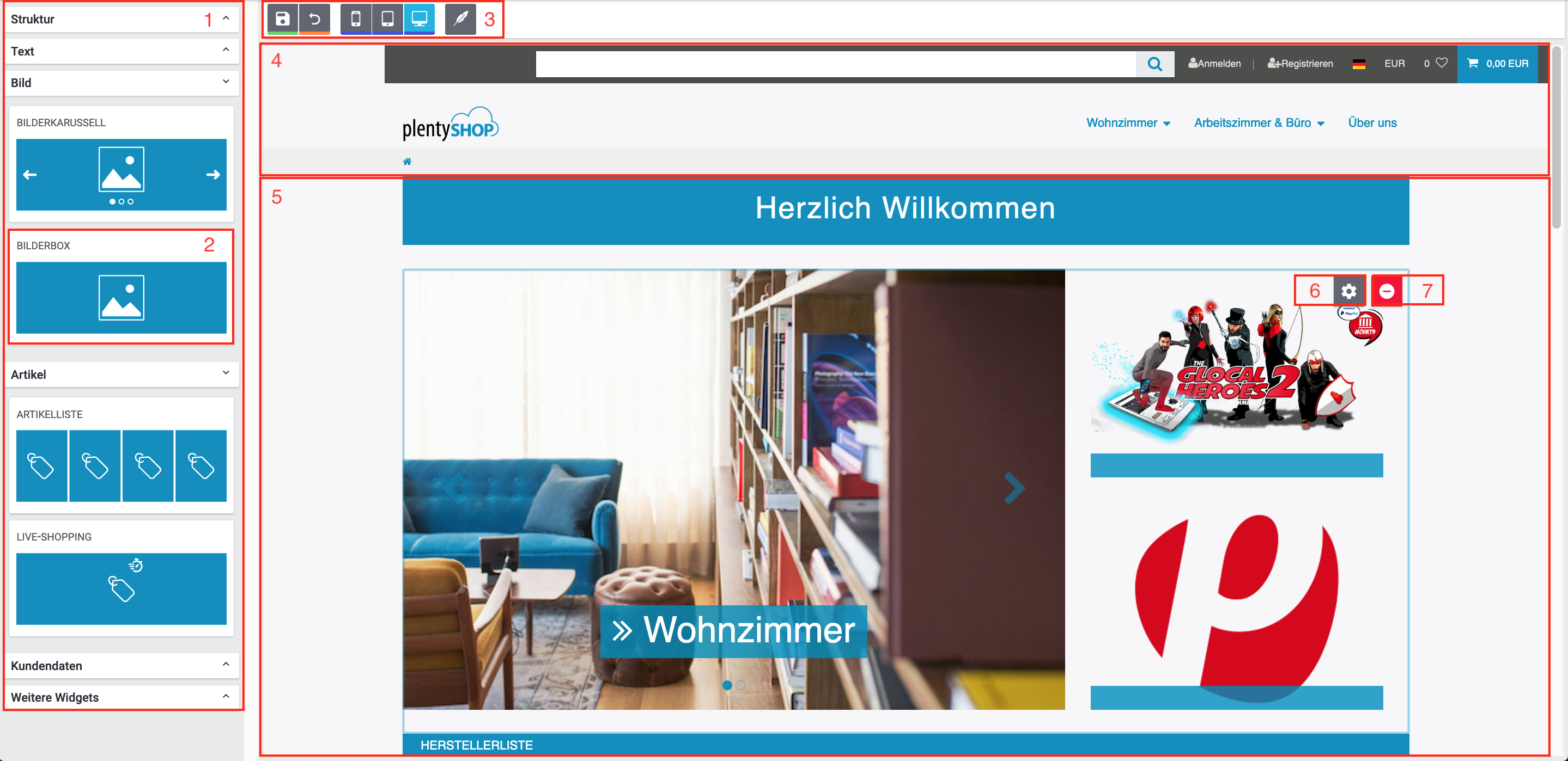
| Flag | Setting | Explanation |
|---|---|---|
1 |
Widget selection |
You can access the widget selection on the left side of the editor. There, you will find all widgets that are available for the current area (body, header, footer) and the current page (content, checkout, My Account). The widgets in the widget selection are grouped into sections. These sections are collapsed by default and can be expanded by clicking the section title to reveal the widgets of the corresponding sections. |
2 |
Widget |
Every sub-section of the widget selection contains widgets that fulfil a very specific purpose. You add widgets to the page by clicking on a widget in the selection and dragging it onto the body area (5). You can find a list of all widgets and their settings below. |
3 |
Toolbar |
The toolbar contains the Save button, the Reset to last save button, the View selection, and the Design settings. |
4 |
Header area |
In the editor view, the three areas header, body, and footer are separated from one another, because a number of widgets are only available for one of these areas. The page body is separated from the header and footer by dotted lines. You can switch the corresponding area by double-clicking another area. Header and footer are globally active; changes you make to the header and footer affect the rest of your online store. |
5 |
Body area |
The area between header and footer constitutes the body area of your page. The page body is not globally active. Drag widgets from the widget selection to this area in order to add them to your page. |
6 |
Widget settings |
Most widgets have additional settings that can be opened by clicking the gear wheel button. The widget settings are then displayed on the right side of the editor view. Widget settings are carried out for each individual widget; changes to one widget do not affect another widget of the same type. |
7 |
* |
Delete widget* |
3. Widgets
The following section elaborates on all currently existing ShopBuilder widgets. The descriptions of the widgets are sorted by category and contain the widget type as well as the various widget settings.
3.1. Header
The following widgets can only be used in the header area of a page. However, you can also use most other widgets, that are not specifically labelled as header widgets, in the header, even if they are not listed in this category.
3.1.1. Breadcrumb navigation
This widget provides the breadcrumb navigation that helps your customers navigate to the homepage and other levels of your online store. Click Edit to open the widget settings.
| Setting | Explanation |
|---|---|
Fix when scrolling page |
Activate to always display the breadcrumb navigation when users scroll through the page. |
Display on homepage |
Activate to display the breadcrumb navigation on the homepage. |
Display in My account area |
Activate to display the breadcrumb navigation in the My Account area. |
Display in checkout |
Activate to display the breadcrumb navigation in the checkout. |
Display in content categories |
Activate to display the breadcrumb navigation on category pages of the type Content. |
Category navigation
This widget provides the category navigation. Click Edit to open the widget settings.
| Setting | Explanation |
|---|---|
Fix when scrolling page |
Activate to always display the breadcrumb navigation when users scroll through the page. |
Style of the category navigation |
Select whether the category navigation is displayed in its normal layout or in the form of a mega menu. |
Category levels of the mega menu |
Select whether the mega menu displays 2, 3, or 4 category levels. This setting is only applicable if mega menu has been selected as the Style of the category navigation. |
Number of categories |
Enter the number of categories to be displayed in the individual levels of the mega menu. This setting is only applicable if mega menu has been selected as the Style of the category navigation. |
Company logo |
Select the image file that you want to display as your company logo in the upper left corner of the online store. The common image formats (PNG, JPG, etc.) are applicable. |
3.1.2. Top bar
This widget provides a top bar for the header. Click Edit to open the widget settings.
| Setting | Explanation |
|---|---|
Fix when scrolling page |
Activate to always display the breadcrumb navigation when users scroll through the page. |
Display of the search |
Select whether the search is always displayed, is hidden by default or is not displayed at all. |
Display item images in search suggestions |
Activate to display item images in the search recommendations. |
Item search: forward to item view |
Activate to forward customers directly to the single item view if they click a suggested search result. |
Display customer login |
Activate to display the login button in the top bar. |
Display customer registration |
Activate to display the customer registration in the top bar. |
Display language selection |
Activate to display the language selection in the top bar. Languages you want to make available to your customers have to be activated in the Languages tab of the plentyShop LTS configuration. |
Display country of delivery selection |
Activate to make the selection of the country of delivery available by clicking the flag symbol in the top bar. |
Display currency selection |
Activate to make the currency selection available by clicking the flag symbol in the top bar. Currencies you want to make available to your customers have to be activated in the Currencies tab of the plentyShop LTS configuration. |
Display wish list |
Activate to include a link to the wish list in the top bar. |
Display shopping cart preview |
Activate to display the shopping cart symbol in the top bar. Clicking the shopping cart symbol displays the shopping cart preview. |
Show shopping cart information |
Select whether the value of items, the quantity of items, or a combination of both is displayed in the shopping cart preview. |
3.1.3. Language detection
This widget recognises the user’s browser language and offers a redirect to shop contents in the detected language.
| Setting | Explanation |
|---|---|
CSS class |
Add additional CSS classes to customise the widget’s style. You can add any number of CSS classes. |
Appearance |
Select a colour from the drop-down list. This value determines the colour of the tab titles in the widget. You define the colour options in the Design menu. |
Activate automatic redirect |
Activate the checkbox in order to redirect users automatically to contents in the detected browser language. |
Edit paddings |
Activate to display additional formatting options. You can edit all paddings and margins separately. |
Edit margins |
Activate to display additional formatting options. You can edit all paddings and margins separately. |
3.2. Structure
Structure widgets serve to structure the layout of your pages. They do not contain own content but can be filled with other widgets. Structure widgets can also be filled with other structure widgets in order to enable a large number of possible layout options.
3.2.1. Grid with 4 columns
This widget provides a structure element with 4 columns. The 4 columns are displayed next to one another in the ratio 1:1:1:1. This widget has no other settings.
3.2.2. Grid with 3 columns
This widget provides a structure element with 3 columns. The 3 columns are displayed next to one another in the ratio 1:1:1:1. Click Edit to open the widget settings.
| Setting | Explanation |
|---|---|
Layout |
Select a layout option. This option determines the size and arrangement of the columns: 30%:30%:30% = The 3 columns are displayed next to one another in the ration 1:1:1. |
3.2.3. Grid with 2 columns
This widget provides a structure element with 2 columns. The 2 columns are displayed next to one another in the ratio 1:1. Click Edit to open the widget settings.
| Setting | Explanation |
|---|---|
Layout Desktop |
Select a layout option for the desktop view. This option determines the size and arrangement of the columns: 50%:50% = The 2 columns are displayed next to one another in the ration 1:1. |
Layout Tablet |
Select a layout option for the tablet view. This option determines the size and arrangement of the columns: 50%:50% = The 2 columns are displayed next to one another in the ration 1:1. |
Layout Mobile |
Select a layout option for the mobile view. This option determines the size and arrangement of the columns: 50%:50% = The 2 columns are displayed next to one another in the ration 1:1. |
3.2.4. Sticky container
Provides a structure element which has a fixed position and is thereby always visible when scrolling the page. The sticky container can be filled with other structure elements or widgets. The sticky container itself has no further settings.
3.2.5. Tabs
This widget provides a structure element, with which you can group other widgets together via tabs. Click Edit to open the widget settings.
| Setting | Explanation |
|---|---|
Appearance |
Select a colour from the drop-down list. This value determines the colour of the tab titles in the widget. You define the colour options in the Design menu. |
Tab title |
Enter a title for the tab. “Tab 1” is the default name. |
Add new entry |
Click the plus icon () to add a new tab to the widget. |
Remove entry |
Click on the minus icon () to remove a tab from the widget. |
3.2.6. Additional information
Use the Additional Information widget to add a button to our shop via which users can open a pop-up, which contains additional content. By clicking the button you can open an area in which you can place additional widgets. Click Edit to open the widget settings.
| Setting | Explanation |
|---|---|
CSS class |
Add additional CSS classes to customise the widget’s style. You can add any number of CSS classes. |
Appearance |
Select a colour from the drop-down list. This value determines the colour of the tab titles in the widget. You define the colour options in the Design menu. |
Title |
Enter a title. This is displayed at the top of the pop-up, which is opened by clicking the Additional information button. |
Orientation |
Select the direction in which you want the pop-up to open. |
Size |
Select the size of the pop-up. |
Icon |
Select the icon that is displayed on the button that opens the pop-up. |
Button size |
Select the size of the the button that opens the pop-up. |
Edit paddings |
Activate to display additional formatting options. You can edit all paddings and margins separately. |
Edit margins |
Activate to display additional formatting options. You can edit all paddings and margins separately. |
3.3. Text
This widget category lists all widgets that process text in any form.
3.3.1. Title bar
This widget provides a text box for the title of your online store. Click Edit to open the widget settings. You can open the inline text editor by clicking the pencil() icon on the widget. In this editor you can edit and format text directly in the widget. You can only enter plain text; if you want to enter HTML, please use the code widget.
| Setting | Explanation |
|---|---|
Appearance |
Select a colour from the drop-down list. This value determines the colour of the title bar. You define the available colour options in the Design menu. |
Edit paddings |
Activate to display additional formatting options. You can edit all paddings and margins separately. |
Edit margins |
Activate to display additional formatting options. You can edit all paddings and margins separately. |
3.3.2. Code
This widget provides a text box with which you can enter HTML and Javascript via inline editing. Click the </> button to open the code editor. Click Edit to open the widget settings.
| Setting | Explanation |
|---|---|
Appearance |
Select a colour from the drop-down list. This value determines the colour of the widget.. You define the available colour options in the Design menu. |
Edit paddings |
Activate to display additional formatting options. You can edit all paddings and margins separately. |
Edit margins |
Activate to display additional formatting options. You can edit all paddings and margins separately. |
|
If you want to include Javascript scripts in the online store, you need to use a <script2> tag in the code widget. This tag functions like a common <script> tag. You can find the documentation for the framework that the ShopBuilder uses here. |
3.3.3. Text
This widget provides a text box. Click Edit to open the widget settings. You can open the inline text editor by clicking the pencil() icon on the widget. In this editor you can edit and format text directly in the widget. You can only enter plain text; if you want to enter HTML, please use the code widget.
| Setting | Explanation |
|---|---|
Appearance |
Select a colour from the drop-down list. This value determines the colour of the widget.. You define the available colour options in the Design menu. |
Edit paddings |
Activate to display additional formatting options. You can edit all paddings and margins separately. |
Edit margins |
Activate to display additional formatting options. You can edit all paddings and margins separately. |
3.3.4. List
This widget provides a list. This widget is empty by default. Click Edit to open the widget settings.
| Setting | Explanation |
|---|---|
List title |
Enter a title for the list. The title is displayed above the list entries on the left. |
Icon |
Select an icon from the drop-down list. The title is displayed to the left of the list entries on the left. You can only set the icon for the entire widget, not for the individual list entry. The default value is none. |
Centre list |
Activate to place the list in the centre of the widget. If this option is deactivated, the list is displayed on the left side. |
Displayed text |
Enter the text you want to display. This text is the content of the list entry. |
URL |
Select a URL to which the list entry links. You can select one of 4 link targets: File (File Manager) = Click Select file to choose a file to which you want to link. If you do not want to link to a target, leave the selection empty. |
Open in new tab |
Activate to open the link target in a new browser tab after clicking the list entry. This setting only applies if a link target has been defined in the URL field. |
Add new entry |
Click the plus icon () to add a new list entry to the widget. You can set the text, the URL, and the option open in new tab for each list entry individually. |
Remove entry |
Click the minus button () next to the input field Displayed text to remove the corresponding list entry. |
Edit paddings |
Activate to display additional formatting options. You can edit all paddings and margins separately. |
Edit margins |
Activate to display additional formatting options. You can edit all paddings and margins separately. |
3.3.5. FAQ
This widget provides a text box with which you can display frequently asked questions in your online store. The corresponding answer is displayed after clicking the question. Click Edit to open the widget settings.
| Setting | Explanation |
|---|---|
Appearance |
Select a colour from the drop-down list. This value determines the colour of the widget.. You define the available colour options in the Design menu. |
Question |
Enter the text for your FAQ question. The corresponding answer is displayed after clicking the question. |
Reply to |
Enter the answer for the FAQ question. The text editor provides the most important formatting options. |
Add new entry |
Click the plus icon () to add a new question to the widget. Enter the text for each new question and answer. |
Remove entry |
Click the minus button () next to the input field Question to remove the corresponding question. |
Edit paddings |
Activate to display additional formatting options. You can edit all paddings and margins separately. |
Edit margins |
Activate to display additional formatting options. You can edit all paddings and margins separately. |
3.4. Image widgets
This widget category lists all widgets that are available for displaying images in your online store.
3.4.1. Image carousel
This widget provides the image carousel. Click Edit to open the widget settings.
| Setting | Explanation |
|---|---|
Appearance |
Select a colour from the drop-down list. This determines the colour of the navigational arrows and dots as well as the image title. You define the available colour options in the Design menu. |
Aspect ratio |
Select the aspect ratio. Select the aspect ratio from the drop-down list that you want to use for e.g. upright images. Please make sure that the images you use are fitted for the selected aspect ratio. If you select the option automatic, the images scale in correspondence to the screen size. |
Caption type |
Select either default title, custom title, or no title. The colour of the title depends on the selected appearance. Default title = This option draws on already existing titles. If a category is set as the source, the category name is used as the default title. If a variation ID is set as the source, the variation name is used as the default title. |
Source |
The source serves as both the image source and a link target. File (File Manager) = Click Select file to select a file to which you want to link. |
Open in new tab |
Activate to open the link target in a new browser tab after clicking the slide on the image carousel. This setting only applies if a link target has been defined in the URL field. |
Image selection |
Select an image file from your file manager. The image selection overwrites the category or variation image. That way, you can display images in the carousel that you do not use for items or categories. Use the image selection to store an image for a file (file manager) or an external link. |
Add new entry |
Click the plus icon () to add a new image tile. You can determine the source, title, type of title, and image selection for each slide separately. |
Remove entry |
Click on the minus button ( next to the input field Caption type to remove the corresponding image tile. |
Edit margins |
Activate to display additional formatting options. You can edit all paddings and margins separately. |
3.4.2. Image box
This widget provides an image box in which you can display individual images that can link to categories or variations. Click Edit to open the widget settings.
| Setting | Explanation |
|---|---|
Appearance |
Select a colour from the drop-down list. This determines the colour of the text box inside the image box. You define the available colour options in the Design menu. |
Aspect ratio |
Select the aspect ratio. Select the aspect ratio from the drop-down list that you want to use for e.g. upright images. Please make sure that the images you use are fitted for the selected aspect ratio. If you select the option automatic, the images scale in correspondence to the screen size. |
Box style |
Select the relation between image and text in the widget. Image and text (full width) = The text is displayed as a footer of the image; the width corresponds to the width of the image. |
Image size |
Select whether the image is displayed fullwidth or scales according to the height. |
Source |
The source serves as both the image source and a link target. File (File Manager) = Click Select file to select a file to which you want to link. |
Open in new tab |
Activate to open the link target in a new browser tab after clicking the image box. This setting only applies if a link target has been defined in the URL field. |
Custom caption |
Activate to enable inline editing for the text box. If this option is active, you can click the pencil button ( on the widget to directly edit the text in the widget. |
Image selection |
Select an image file from your file manager. The image selection overwrites the category or variation image. That way, you can display images in the carousel that you do not use for items or categories. Use the image selection to store an image for a file (file manager) or an external link. |
Edit margins |
Activate to display additional formatting options. You can edit all paddings and margins separately. |
3.4.3. Background image:
This widget provides an image box in which you can display individual images that can link to categories or variations. Click Edit to open the widget settings.
| Setting | Explanation |
|---|---|
CSS class |
Add additional CSS classes to customise the widget’s style. You can add any number of CSS classes. |
Full screen width |
Activate this option to upsize the background image to the screen size, independent of image size. |
Increase font size |
Activate this option to increase the font size of widgets of the widget category Text that have been placed in the background image widget. |
Fix in background |
Activate this option to fix the background image. If this option is inactive, the image scrolls down when a user scrolls down the page. |
Colour |
Select a colour from the drop-down list. The colour is used as the background if no image has been selected for the background widget. If an image has been selected that is smaller than the widget container, the selected colour fills the remaining space. You define the available colour options in the Design menu. |
Background image |
Select the image you want to use as the background image. If you select the option None, only the selected colour will be used to fill out the background container. The options Category image 1 and Category image 2 use the images stored in the category settings of the current category. If you select the option Custom image, the image selection is displayed, via which you can upload an image file. |
Image scaling |
Select the way in which the selected image is supposed to scale in relation to the screen. Select Oriented on long side of the image to scale the selected image to the entire size of the image container, even if parts of the image get cut off in the process. This corresponds to the CSS statement cover. Select Oriented on short side of the image to always display the image in full, if if this means that it does not completely fill out the background container. This corresponds to the CSS statement contain |
Repeat image |
Activate this image to continually repeat the image at the end of the background image widget. If this option is inactive, the selected image is only displayed once. |
Opacity |
Use the slider to determine the opacity of the selected image. The value 0 fades the image completely. |
Minimum height |
Select the background image widget’s minimum height. If you select the option None, the background image widget assumes the height of the contained content, i.e. other widgets. The options xs to xl increase the minimum height to above the height of the contained widgets. The option Auto ensures that a background image widget in a grid widget assumes the height of the largest widget contained in the same grid widget. If the background image widget is not placed in a grid image, the option Auto has the same effect as the option None. |
Lazy load the background image |
Activate to load images that are located in the non-visible area upon page access at a later time. This reduces the initial loading time of the page, thereby improving plentyShop performance. Do not activate this setting for images that are located in the area that is initially visible on the page. You can find additional information about how to use Lazy Loading in our PageSpeed Insights Best Practice. |
Edit paddings |
Activate to display additional formatting options. You can edit all paddings and margins separately. |
Edit margins |
Activate to display additional formatting options. You can edit all paddings and margins separately. |
3.5. Item
This widget category lists all widgets that serve to display item date in the online store.
3.5.1. Tags
This widget displays tags that have been linked to variations.
If users click on a tag, they are forwarded to a search result page that lists all variations linked with this tag.
To enable tag redirects in the front end, the route /tags has to be activated in the IO settings in the Configuration » Routing » Activate routes menu.
| Setting | Explanation |
|---|---|
CSS class |
Add additional CSS classes to customise the widget’s style. You can add any number of CSS classes. |
Tag look |
Select whether the form of the tags is standard or with rounded corners. |
Tag size |
Select small, default, or large as the tag size. |
Edit margins |
Activate to display additional formatting options. You can edit all paddings and margins separately. |
3.5.2. Attribute selection
This widget provides the selection of attributes for the single item view. In the plentyShop LTS assistant, you can determine whether you want to display and preselect the “Please choose” option in the attribute selection. Click Edit to open the widget settings.
| Setting | Explanation |
|---|---|
Appearance |
Select a colour from the drop-down list. This value determines the colour of the widget.. You define the available colour options in the Design menu. |
Always display content selection |
Activate to always make the content of the variation available in the selection. If this option is inactive, the content is only displayed if it serves to differentiate the variations. |
Edit margins |
Activate to display additional formatting options. You can edit all paddings and margins separately. |
3.5.3. Add to basket
This widget provides the Add to basket button with which your customers can move items to their shopping cart. Click Edit to open the widget settings.
| Setting | Explanation |
|---|---|
Appearance |
Select a colour from the drop-down list. This value determines the colour of the widget.. You define the available colour options in the Design menu. |
Button size |
Select small, default, or large as the button size. |
Edit paddings |
Activate to display additional formatting options. You can edit all paddings and margins separately. |
Edit margins |
Activate to display additional formatting options. You can edit all paddings and margins separately. |
3.5.4. Add to wish list
This widget provides the Add to wish list button with which your customers can move items to their wish list. Click Edit to open the widget settings.
| Setting | Explanation |
|---|---|
Appearance |
Select a colour from the drop-down list. This value determines the colour of the widget.. You define the available colour options in the Design menu. |
Edit margins |
Activate to display additional formatting options. You can edit all paddings and margins separately. |
3.5.5. Item availability
This widget provides a note about the item availability. You can save various availabilities in the Setup » Item » Availability menu and define them per item. Click Edit to open the widget settings.
| Setting | Explanation |
|---|---|
Edit paddings |
Activate to display additional formatting options. You can edit all paddings and margins separately. |
Edit margins |
Activate to display additional formatting options. You can edit all paddings and margins separately. |
3.5.6. Item image
This widget provides the images stored for an item. Click Edit to open the widget settings.
| Setting | Explanation |
|---|---|
Appearance |
Select a colour from the drop-down list. This value determines the colour of the widget.. You define the available colour options in the Design menu. |
Maximum number of images |
Enter the maximum number of images you want to display on the single item view. |
Image size |
Select an image size. You can choose between the 4 sizes Small preview, Large preview, Medium, and Large. These sizes correspond to the 4 sizes in the Setup » Item » Images » Sizes menu. |
Display preview images |
Activate to show preview images under the large item image. The preview images are taken from the images stored for the item. |
Display navigation dots |
Activate to show navigation dots under the large item image. |
3.5.7. Item bundle
This widget provides an overview over the items that are contained in an item bundle. Click Edit to open the widget settings.
| Setting | Explanation |
|---|---|
Appearance |
Select a colour from the drop-down list. This value determines the colour of the widget.. You define the available colour options in the Design menu. |
Edit paddings |
Activate to display additional formatting options. You can edit all paddings and margins separately. |
Edit margins |
Activate to display additional formatting options. You can edit all paddings and margins separately. |
3.5.8. Order characteristics
This widget provides the selection of order characteristics for the single item view. Click Edit to open the widget settings.
| Setting | Explanation |
|---|---|
Appearance |
Select a colour from the drop-down list. This value determines the colour of the widget.. You define the available colour options in the Design menu. |
Edit paddings |
Activate to display additional formatting options. You can edit all paddings and margins separately. |
Edit margins |
Activate to display additional formatting options. You can edit all paddings and margins separately. |
3.5.9. Item price
This widget displays the price of an item. If applicable, the widget also displays the Content and the Base price. Click Edit to open the widget settings.
| Setting | Explanation |
|---|---|
Show strikethrough price |
Activate the option to display the crossed out RRP in the widget above the current item price. For this, at least one more price of the type Special offer has to be created in addition to the RRP. |
Appearance |
Select a colour from the drop-down list. This value determines the colour of the widget.. You define the available colour options in the Design menu. |
Edit margins |
Activate to display additional formatting options. You can edit all paddings and margins separately. |
3.5.10. Graduated price
This widget provides graduated prices for the single item view. Click Edit to open the widget settings. In order to use graduated prices, you need to configure the prices of your items accordingly.
[[Graduated price]] .Settings Graduated prices
| Setting | Explanation |
|---|---|
Appearance |
Select a colour from the drop-down list. This value determines the colour of the widget.. You define the available colour options in the Design menu. |
Edit paddings |
Activate to display additional formatting options. You can edit all paddings and margins separately. |
Edit margins |
Activate to display additional formatting options. You can edit all paddings and margins separately. |
3.5.11. Item data table
This widget provides a table that lists stored item data. Click Edit to open the widget settings.
| Setting | Explanation |
|---|---|
Edit paddings |
Activate to display additional formatting options. You can edit all paddings and margins separately. |
Edit margins |
Activate to display additional formatting options. You can edit all paddings and margins separately. |
Displayed item information |
Select item data from the drop-down list to show the corresponding data field in the item data table. Item ID = Activate to display the item’s ID. |
Add new entry |
Click the plus icon () to add a new row to the table. |
Remove entry |
Click on the minus icon ( to remove an entry from the table. |
3.5.12. Item list
This widget provides item lists. Click Edit to open the widget settings.
| Setting | Explanation |
|---|---|
Appearance |
Select a colour from the drop-down list. This determines the colour of the list title as well as the buttons on the item tile. You define the available colour options in the Design menu. |
Caption type |
Select either default title, custom title, or no title. The colour of the title depends on the selected appearance. Default title = This option draws on already existing titles. If a category is set as the source, the category name is used as the default title. If a variation ID is set as the source, the variation name is used as the default title. |
Item list type |
Select which type of item list you want to use for your list: Category items = Select this option to generate a list consisting of items of a single category. If this option is active, the additional field category is displayed in the widget settings. Clicking this field opens the category picker. Select the desired category and confirm the selection at the lower end of the |
Item sorting |
Select the sorting option according to which the item list should be sorted. |
Maximum number of items |
Enter the maximum number items that are listed. |
Number of visible items |
Enter the number of items that should be displayed next to each other in a row. |
Edit paddings |
Activate to display additional formatting options. You can edit all paddings and margins separately. |
Edit margins |
Activate to display additional formatting options. You can edit all paddings and margins separately. |
3.5.13. Live shopping
Provides a container for live shopping items. Click Edit to open the widget settings. Important: To use live shopping, you must have created at least one live shopping profile. Furthermore, you must have created a purchase price of the price type Special offer.
| Setting | Explanation |
|---|---|
Live shopping selection |
Select one of 10 possible live shopping profiles that are set up in the Setup » plentyShop » Global Settings » Liveshopping menu. |
Sorting |
Select the sorting option by which the variation is selected that is displayed as the first variation. |
Show timer |
Activate the option to show a running countdown for the live shopping offer. |
Show time-dependent progress bar |
Activate this option to show a progress bar below the time countdown. |
Show stock |
Activate to show the remaining stock. |
Show stock-dependent progress bar |
Activate this option to show a progress bar below the stock countdown. |
Show strikethrough price |
Activate the option to display the RRP in the widget next to the special offer. You need to set up at least the RRP and one additional purchase price of the type special offer. |
Image selection |
Select the image file from your file manager you want to display in the live shopping container. It replaces the variation image. |
Edit paddings |
Activate to display additional formatting options. You can edit all paddings and margins separately. |
Edit margins |
Activate to display additional formatting options. You can edit all paddings and margins separately. |
3.6. Customer data
This widget category lists all widgets that are used for displaying and managing customer data.
3.6.1. Welcome
This widget provides a text box for welcoming your customers to your My Account area. Click Edit to open the widget settings.
| Setting | Explanation |
|---|---|
Form of address |
Select the form of address you want to use: . First and last name: Displays the text “Hello, John Doe”. |
Edit margins |
Activate to display additional formatting options. You can edit all paddings and margins separately. |
3.6.2. Address selection
This widget provides the address selection with which customers can enter their delivery and invoice address in the checkout and My Account area. Click on the pencil () button on the widget to open the inline editor. That way, you can edit the text directly in the widget’s editor window. Click Edit to open the widget settings.
| Setting | Explanation |
|---|---|
Appearance |
Select a colour from the drop-down list. This determines the colour of the New address button. You define the available colour options in the Design menu. |
Preselected form of address |
Select the option you want to preselect from the address drop-down list. We added the option Mx for diverse, e.g. non-binary, genders. Select company for your B2B customers. You can adjust the terms in the Shop » Multilingualism menu. |
Address type |
Select invoice or delivery address. |
Address format |
Select DE or UK. Depending on which address format you select, different address fields can be displayed and configured as required fields. |
Show invoice and shipping address fields |
Select the address fields that are displayed to your customers when they enter their address. |
Required fields for invoice and shipping address |
Select the address fields that your customers must fill out before they can place an order. If these fields are not filled in when the customer clicks the purchase button, the order cannot be placed. The following address fields are available for the address selection: |
Edit paddings |
Activate to display additional formatting options. You can edit all paddings and margins separately. |
Edit margins |
Activate to display additional formatting options. You can edit all paddings and margins separately. |
|
Address fields “Company” and “Contact person”
The address input fields now contain the option Contact person. The Contact person field is only relevant for B2B customers. The Company and Contact person fields interact as follows:
|
3.7. Shopping cart
This widget category lists all widgets that are available for displaying shopping cart information in your online store.
3.7.1. Shopping cart content
This widget provides an overview over the items that are currently in the customers shopping cart. The shopping cart content is not rendered in the editor view of the ShopBuilder and can therefore not be displayed. Click Edit to open the widget settings.
| Setting | Explanation |
|---|---|
Appearance |
Select a colour from the drop-down list. This value determines the colour of the widget.. You define the available colour options in the Design menu. |
Edit margins |
Activate to display additional formatting options. You can edit all paddings and margins separately. |
3.7.2. Coupon input
This widget provides an input field via which your customers can redeem coupon codes. Click Edit to open the widget settings.
| Setting | Explanation |
|---|---|
Appearance |
Select a colour from the drop-down list. This value determines the colour of the widget.. You define the available colour options in the Design menu. |
Edit margins |
Activate to display additional formatting options. You can edit all paddings and margins separately. |
3.7.3. Totals
This widget provides an overview over the totals, calculated on the basis of the items that are currently in the customer’s shopping cart. Click Edit to open the widget settings.
| Setting | Explanation |
|---|---|
Show price information |
Select which Price information is displayed in the totals overview. Available price information: |
3.8. Contact
This category lists all widgets that are necessary to set up your contact page.
3.8.1. Contact data
This widget provides a list of your contact data, including address, phone, fax, and email. Click Edit to open the widget settings.
| Setting | Explanation |
|---|---|
CSS class |
Add additional CSS classes to customise the widget’s style. You can add any number of CSS classes. |
Appearance |
Select a colour from the drop-down list. This value determines the colour of the widget.. You define the available colour options in the Design menu. |
Telephone |
Enter a phone number that is displayed next to the phone icon in the contact data. |
Fax |
Enter a fax number that is displayed next to the fax icon in the contact data. |
Enter an email address that is displayed next to the email icon in the contact data. |
|
Edit margins |
Activate to display additional formatting options. You can edit all paddings and margins separately. |
3.9. Checkout
This category lists all widgets that are necessary to set up your order process.
3.9.1. Shipping method selection
This widget provides the selection of available shipping methods in the online store. This widget is limited to 1 per page. Click on the pencil () button on the widget to open the inline editor and edit the title directly in the widget. Click Edit to open the widget settings.
| Setting | Explanation |
|---|---|
Appearance |
Select a colour from the drop-down list. This value determines the colour of the widget.. You define the available colour options in the Design menu. |
Edit paddings |
Activate to display additional formatting options. You can edit all paddings and margins separately. |
Edit margins |
Activate to display additional formatting options. You can edit all paddings and margins separately. |
3.9.2. Payment method selection
This widget provides the selection of available payment methods in the online store. Only configured and activated payment plugins are displayed. This widget is limited to 1 per page. Click on the pencil () button on the widget to open the inline editor and edit the title directly in the widget. Click Edit to open the widget settings.
| Setting | Explanation |
|---|---|
Appearance |
Select a colour from the drop-down list. This value determines the colour of the widget.. You define the available colour options in the Design menu. |
Edit paddings |
Activate to display additional formatting options. You can edit all paddings and margins separately. |
Edit margins |
Activate to display additional formatting options. You can edit all paddings and margins separately. |
3.9.3. Notes and requests
This widget provides a text box with which customers can add notes and requests to their order. Click on the pencil () button on the widget to open the inline editor and edit the title directly in the widget. Click Edit to open the widget settings.
| Setting | Explanation |
|---|---|
Edit margins |
Activate to display additional formatting options. You can edit all paddings and margins separately. |
3.9.4. Terms and conditions checkbox
This widget provides a checkbox with which customers can agree to your general terms and conditions. This widget is limited to 1 per page. Click Edit to open the widget settings.
| Setting | Explanation |
|---|---|
Hide checkbox |
Activate to hide the checkbox in the online store. The checkbox is checked by default. |
Preselect checkbox |
Activate to activate the checkbox by default. |
Required |
Activate to make the checkbox mandatory before customers can place an order. |
Text |
Enter text. This text overwrites the text next to the checkbox. |
Edit margins |
Activate to display additional formatting options. You can edit all paddings and margins separately. |
3.9.5. Shipping information checkbox
This widget provides a checkbox with which your customers can agree to transmit their shipping information to the corresponding shipping service provider. The checkbox will only be displayed in the online store if a shipping profile is selected for which the option Agreement upon data transfer is active. Click Edit to open the widget settings.
| Setting | Explanation |
|---|---|
Edit margins |
Activate to display additional formatting options. You can edit all paddings and margins separately. |
3.9.6. Newsletter checkbox
Provides a checkbox with which customers can subscribe to one of your newsletters. Click Edit to carry out the widget settings.
| Setting | Explanation |
|---|---|
ID of the email folder |
Enter the ID of the email folder you want to use for the newsletter registration. |
Hide checkbox |
Activate to hide the checkbox in the online store. The checkbox is checked by default. |
Preselect checkbox |
Activate to activate the checkbox by default. |
Required |
Activate to make the checkbox mandatory before customers can place an order. |
Text |
Enter text. This text overwrites the text next to the checkbox. |
Edit margins |
Activate to display additional formatting options. You can edit all paddings and margins separately. |
3.9.7. Purchase button
This widget provides the button with which customers can place an order in the online store. Click Edit to open the widget settings.
| Setting | Explanation |
|---|---|
Appearance |
Select a colour from the drop-down list. This value determines the colour of the widget.. You define the available colour options in the Design menu. |
Button size |
Select small, default, or large as the button size. |
Edit paddings |
Activate to display additional formatting options. You can edit all paddings and margins separately. |
Edit margins |
Activate to display additional formatting options. You can edit all paddings and margins separately. |
3.9.8. Cancel payment button
This widget provides a button with which your customers can abort a verified purchase they placed via a payment plugin (e.g. PayPal). Click Edit to open the widget settings.
| Setting | Explanation |
|---|---|
Appearance |
Select a colour from the drop-down list. This value determines the colour of the widget.. You define the available colour options in the Design menu. |
Button size |
Select small, default, or large as the button size. |
Edit paddings |
Activate to display additional formatting options. You can edit all paddings and margins separately. |
Edit margins |
Activate to display additional formatting options. You can edit all paddings and margins separately. |
3.10. My Account
This widget category lists all widgets that serve to design the customer area of your online store.
3.10.1. Account settings
This widget provides your customers with an overview over their account settings via which they can change their email address and their password. Click on the pencil icon to edit the widget title and the description text with the inline editor. Click Edit to open the widget settings.
| Setting | Explanation |
|---|---|
Appearance |
Select a colour from the drop-down list. This determines the colour of the Change email address and Change password buttons. You define the available colour options in the Design menu. |
Edit paddings |
Activate to display additional formatting options. You can edit all paddings and margins separately. |
Edit margins |
Activate to display additional formatting options. You can edit all paddings and margins separately. |
3.10.2. Bank details
This widget provides your customers with an overview over their banking information. Click on the pencil icon to edit the widget title and the description text with the inline editor. Click Edit to open the widget settings.
| Setting | Explanation |
|---|---|
Appearance |
Select a colour from the drop-down list. This determines the colour of the Add bank details button. You define the available colour options in the Design menu. |
Edit margins |
Activate to display additional formatting options. You can edit all paddings and margins separately. |
3.10.3. Order history
This widget provides a list of your customers’ past orders. The order history contains the order ID, totals, order date, shipping date, and the order status. Click on the pencil icon to edit the widget title and the description text with the inline editor. Click Edit to open the widget settings.
| Setting | Explanation |
|---|---|
Appearance |
Select a colour from the drop-down list. This value determines the colour of the title pagination. You define the available colour options in the Design menu. |
Orders per page |
Select the number of orders that are listed per page. |
Allow changing the payment method |
Activate to allow your customers to change the payment method at a later time. |
Allow returns |
Activate to allow customers to return their orders. |
Edit margins |
Activate to display additional formatting options. You can edit all paddings and margins separately. |
3.10.4. Return history
This widget provides a list of your customers’ past returns. The returns history contains the return ID, order ID, return date, the selected payment method, and relevant return documents of the order. Click on the pencil icon to edit the widget title and the description text with the inline editor. Click Edit to open the widget settings.
| Setting | Explanation |
|---|---|
Appearance |
Select a colour from the drop-down list. This value determines the colour of the title pagination. You define the available colour options in the Design menu. |
Returns per page |
Select the number of returns that are listed per page. |
Edit margins |
Activate to display additional formatting options. You can edit all paddings and margins separately. |
3.10.5. Logout button
This widget provides the button with which customers can log out of the online store. Click Edit to open the widget settings.
| Setting | Explanation |
|---|---|
Appearance |
Select a colour from the drop-down list. This value determines the colour of the button. You define the available colour options in the Design menu. |
Button size |
Select small, default, or large as the button size. |
Edit paddings |
Activate to display additional formatting options. You can edit all paddings and margins separately. |
Edit margins |
Activate to display additional formatting options. You can edit all paddings and margins separately. |
3.11. Order confirmation
This widget category lists all widgets that serve to design the order confirmation.
3.11.1. Order data
The order data widget provides your customers with a list of their data, including order date, status, addresses, selected payment and shipping methods, and payment status. We only display placeholder data in the PlentyONE back end. Click Edit to open the widget settings.
| Setting | Explanation |
|---|---|
CSS class |
Add additional CSS classes to customise the widget’s style. You can add any number of CSS classes. |
Appearance |
Select a colour from the drop-down list. This determines the colour of vertain widget elements. You define the available colour options in the Design menu. |
Show address fields |
Activate all address fields that are to be displayed for invoice and delivery addresses. |
Display customer number |
Activate to display the customer number above the delivery address. |
3.11.2. Order documents
This widget provides a button via which customers can download documents that are relevant for their orders. Click Edit to open the widget settings.
| Setting | Explanation |
|---|---|
CSS class |
Add additional CSS classes to customise the widget’s style. You can add any number of CSS classes. |
Appearance |
Select a colour from the drop-down list. This determines the colour of the button, via which the order documents can be downloaded. You define the available colour options in the Design menu. |
Button size |
Select small, default, or large as the button size. |
Edit paddings |
Activate to display additional formatting options. You can edit all paddings and margins separately. |
Edit margins |
Activate to display additional formatting options. You can edit all paddings and margins separately. |
3.11.3. Purchased items
This widget provides a list of ordered items, including item image, item name, sales price, piece price, and total sum. Click Edit to open the widget settings.
| Setting | Explanation |
|---|---|
CSS class |
Add additional CSS classes to customise the widget’s style. You can add any number of CSS classes. |
Appearance |
Select a colour from the drop-down list. This determines the colour of the item names in the list. You define the available colour options in the Design menu. |
Edit paddings |
Activate to display additional formatting options. You can edit all paddings and margins separately. |
Edit margins |
Activate to display additional formatting options. You can edit all paddings and margins separately. |
3.11.4. Totals
This widget provides a list of order totals. Click Edit to open the widget settings.
| Setting | Explanation |
|---|---|
CSS class |
Add additional CSS classes to customise the widget’s style. You can add any number of CSS classes. |
Show price information |
Activate all pricing information you want to display in the order confirmation. |
Edit margins |
Activate to display additional formatting options. You can edit all paddings and margins separately. |
3.12. Soft login
The soft login page is used to provide customers who order as guests with secure access to their order confirmation. When guest customers open the order confirmation link they receive by email after placing an order, they are first directed to the soft login page.
On the soft login page, customers must again enter the postcode of the delivery or billing address in order to access the order confirmation page. If the customer does not have a postcode, the last name of the billing or delivery address is requested as a substitute.
In the online store step of the plentyShop LTS assistent you can set how long the order confirmation link should be valid for guest customers. You can set the validity to 30 days, 60 days or Always.
If you set the validity of the order confirmation link to Always, guest clients will be redirected to a page after 90 days where they can request a new order confirmation link.
Create a new email template containing the new order confirmation link.
3.12.1. Create email template
Create a new email template for sending the order confirmation link with the EmailBuilder.
This template must contain the variable URL to order confirmation which contains the link to the order confirmation.
After you have created the template, you have to link the template to the corresponding event.
Linking the email template:
-
Open the Email settings in the Setup » Client » Settings » Email accounts menu.
-
Select a client.
-
Select your newly created template from the dropdown menu as order confirmation (Softlogin).
-
Save () your changes.
3.12.2. Create soft login content
To make the soft login page available to your guest customers, create a new ShopBuilder content of type Soft login in the category of your order confirmation page. The soft login page will be displayed automatically when your guest customers access the order confirmation page via the link in the email sent to them.
3.12.3. Edit soft login page texts
You can edit the texts that are displayed on the soft login page via the CMS " Multilingualism menu.
The two translation keys softLoginDescriptionName and softLoginDescriptionPostcode contain the texts that are displayed on the soft login page. softLoginDescriptionPostcode contains the text that will be displayed if guest clients can enter a postcode. If no postcode is available, the text contained in softLoginDescriptionName will be displayed.
3.12.4. Soft login widget
Click Edit to open the widget settings.
| Setting | Explanation |
|---|---|
CSS class |
Add additional CSS classes to customise the widget’s style. You can add any number of CSS classes. |
Appearance |
Select a colour from the drop-down list. This determines the colour of the button on the soft login page. You define the available colour options in the Design menu. |
Edit paddings |
Activate to display additional formatting options. You can edit all paddings and margins separately. |
Edit margins |
Activate to display additional formatting options. You can edit all paddings and margins separately. |
3.13. Item category
This widget category lists all widgets that serve to design the em categories of your online store.
3.13.1. Toolbar
This widget provides a tool bar with which you can arrange filters and sorting options in your item category view. This tool bar serves as a structural element, in which you can place other widgets of the widget category Item category. The tool bar can be expanded. Click Edit to open the widget settings.
| Setting | Explanation |
|---|---|
CSS class |
Add additional CSS classes to customise the widget’s style. You can add any number of CSS classes. |
Appearance |
Select a colour from the drop-down list. This determines the colour of the icons and the corresponding text. You define the available colour options in the Design menu. |
Icon |
Select an icon from the drop-down list. The icon is displayed on the right side of the tool bar. The tool bar is expanded by clicking the icon. The default icon is the Slider. |
Text |
Enter the text you want to display. This is displayed next to the selected icon. |
Edit paddings |
Activate to display additional formatting options. You can edit all paddings and margins separately. |
Edit margins |
Activate to display additional formatting options. You can edit all paddings and margins separately. |
3.13.2. Number of items per page
This widget provides a selection of the number of items that are displayed per page. Click Edit to open the widget settings.
| Setting | Explanation |
|---|---|
CSS class |
Add additional CSS classes to customise the widget’s style. You can add any number of CSS classes. |
Option |
Enter a value. Customers can select this option in the item category view. Click on the Plus icon to add another value. You can arrange the values via the arrow buttons. |
Edit margins |
Activate to display additional formatting options. You can edit all paddings and margins separately. |
3.13.3. Item sorting
This widget provides a selection of sorting options for items. Click Edit to open the widget settings.
| Setting | Explanation |
|---|---|
CSS class |
Add additional CSS classes to customise the widget’s style. You can add any number of CSS classes. |
Sorting options |
Activate all sorting options you want to provide to your customers. You can define the Recommended option in the plentyShop LTS assistant or in the Plugins » plentyShop LTS » Configuration » Pagination and Sorting menu. |
Edit margins |
Activate to display additional formatting options. You can edit all paddings and margins separately. |
3.13.4. Item grid
This widget provides an item grid that lists and arranges your items in the category view. Click Edit to open the widget settings.
| Setting | Explanation |
|---|---|
CSS class |
Add additional CSS classes to customise the widget’s style. You can add any number of CSS classes. |
Appearance |
Select a colour from the drop-down list. This determines the colour of the link to the shipping costs. You define the available colour options in the Design menu. |
Item number per row (desktop) |
Select the number of items that are displayed per row in the desktop view. |
Item number per row (tablet) |
Select the number of items that are displayed per row in the tablet view. |
Item number per row (mobile) |
Select the number of items that are displayed per row on mobile devices. |
Edit paddings |
Activate to display additional formatting options. You can edit all paddings and margins separately. |
Edit margins |
Activate to display additional formatting options. You can edit all paddings and margins separately. |
3.13.5. Pagination
This widget provides the pagination with which your customers can navigate through category and search results pages. Click Edit to open the widget settings.
| Setting | Explanation |
|---|---|
CSS class |
Add additional CSS classes to customise the widget’s style. You can add any number of CSS classes. |
Appearance |
Select a colour from the drop-down list. This value determines the colour of the buttons. You define the available colour options in the Design menu. |
Display “To first page” button |
Activate to display a button in the pagination, via which customers can navigate to the first page. |
Display “To last page” button |
Activate to display a button in the pagination, via which customers can navigate to the last page. |
Additional pages per direction |
Use the slider to determine how many pages are displayed for each direction in the pagination. You can display a maximum of 10 additional pages. |
Alignment |
Select left, centre, or right to determine where the pagination is displayed. |
Edit paddings |
Activate to display additional formatting options. You can edit all paddings and margins separately. |
Edit margins |
Activate to display additional formatting options. You can edit all paddings and margins separately. |
3.13.6. Selected filters
This widget provides your customers with an overview of the currently selected filters. Click Edit to open the widget settings.
| Setting | Explanation |
|---|---|
CSS class |
Add additional CSS classes to customise the widget’s style. You can add any number of CSS classes. |
Alignment |
Select left, centre, or right to determine where the selected filters are displayed. |
Edit paddings |
Activate to display additional formatting options. You can edit all paddings and margins separately. |
Edit margins |
Activate to display additional formatting options. You can edit all paddings and margins separately. |
3.13.7. Filter
You have 5 different filters at your disposal: Filter for attributes, characteristics, and properties, Availability, Price, Category, and Manufacturer. These widgets share the same widget settings which are explained below. Click Edit to open the widget settings.
| Setting | Explanation |
|---|---|
CSS class |
Add additional CSS classes to customise the widget’s style. You can add any number of CSS classes. |
Appearance |
Select a colour from the drop-down list. This determines the colour of the number of items next to a filter. You define the available colour options in the Design menu. |
Edit paddings |
Activate to display additional formatting options. You can edit all paddings and margins separately. |
Edit margins |
Activate to display additional formatting options. You can edit all paddings and margins separately. |
3.14. Footer
This widget category lists all widgets that can only be used in the footer of your online store.
3.14.1. Cookie bar
The cookie bar widget provides the consent management tool to your customers, which they can use to accept and reject cookies in your plentyShop. The cookie bar automatically manages all cookies provided by plentyShop LTS and other plugins. Note that you can carry out additional settings in the plentyShop assistant. Click Edit to open the widget settings.
| Setting | Explanation |
|---|---|
CSS class |
Add additional CSS classes to customise the widget’s style. You can add any number of CSS classes. |
Appearance |
Select a colour from the drop-down list. This value determines the colour of the tab titles in the widget. You define the colour options in the Design menu. |
Edit margins |
Activate to display additional formatting options. You can edit all paddings and margins separately. |
|
Cookies settings in the plentyShop assistant
In the step Online shop of the plentyShop assistant, you can determine how long the essential session cookie is valid in the setting Validity of the cookie. The session cookies serves to bundle information and associate them with a user, so that, for instance, items in the shopping cart remain in the shopping cart as long as the session cookie is valid. |
3.14.2. Legal information
This widget provides a list with links to your legal information, which you can display in the footer of your online store. Your legal information is edited and saved in the Setup » System settings » Client » Select client » Online store » Legal information menu. Click Edit to open the widget settings.
| Setting | Explanation |
|---|---|
Display cancellation rights |
Activate to display the link to your cancellation rights in the footer. The link redirects to the route /cancellation-rights. |
Display legal disclosure |
Activate to display the link to your legal disclosure in the footer. The link redirects to the route /legal-disclosure. |
Display privacy policy |
Activate to display the link to your privacy policy in the footer. The link redirects to the route /privacy-policy. |
Display general terms and conditions |
Activate to display a link to your general terms and conditions in the footer. The link redirects to the route /gtc. |
Display cancellation form |
Activate to display the link to your cancellation form in the footer. The link redirects to the route /cancellation-form. |
Use PDF file as cancellation form |
You can use a PDF file as the cancellation form instead of the text you stored in your back end. By activating this option, the PDF file selection is displayed below, via which you can upload and select a PDF file. |
Edit paddings |
Activate to display additional formatting options. You can edit all paddings and margins separately. |
Edit margins |
Activate to display additional formatting options. You can edit all paddings and margins separately. |
3.15. Miscellaneous
This widget category lists all widgets that cannot be sorted into any other category. It subsumes the widgets GoogleMaps and newsletter registration.
3.15.1. GoogleMaps
Note: This widget is not part of the default plentyShop LTS plugin and hast to be loaded from the plentyMarketplace. After downloading the widget, you need to install it. The widget is available in the widget overview after its installation.
This widget integrates GoogleMaps into your online store. You can, for instance, use it to illustrate the location of your local store. Click Edit to open the widget settings.
| Setting | Explanation |
|---|---|
Google API key |
Enter the API key that is a prerequisite for using GoogleMaps. You receive the API key from link:https://cloud.google.com/maps-platform/maps/?hl The GoogleMaps API may be subject to additional costs. |
Address |
Enter the address that you want to highlight on the map. |
Zoom |
Enter the zoom level for the map view. The default value is 16; higher values zoom in, lower values zoom out. |
3.15.2. Newsletter
This widget provides the newsletter registration for your customers. Click on the pencil icon () to edit the widget title and the description text with the inline editor. Click Edit to open the widget settings.
| Setting | Explanation |
|---|---|
Appearance |
Select a colour from the drop-down list. This value determines the colour of the subscribe button. You define the available colour options in the Design menu. |
Display input fields for first and last name |
Activate to display the input fields for first and last name in addition to the email address. |
Display checkbox for accepting the privacy policy |
Activate to display a checkbox in the newsletter registration with which your customer can accept your privacy policy. |
ID of the email folder |
Enter the ID of the email folder in which the customers’ email addresses are to be stored. You create email folders in the CRM » Newsletter » PlentyONE » Email folder menu. |
Edit margins |
Activate to display additional formatting options. You can edit all paddings and margins separately. |
[[#privacy-policy]] ==== Privacy policy
This widget provides a list of cookies and consents that are used in the shop. Click Edit to open the widget settings.
| Setting | Explanation |
|---|---|
CSS class |
Add additional CSS classes to customise the widget’s style. You can add any number of CSS classes. |
Appearance |
Select a colour from the drop-down list. This value determines the colour of the tab titles in the widget. You define the colour options in the Design menu. |
Edit paddings |
Activate to display additional formatting options. You can edit all paddings and margins separately. |
Edit margins |
Activate to display additional formatting options. You can edit all paddings and margins separately. |
|
Cookies settings in the plentyShop assistant
In the step Online shop of the plentyShop assistant, you can determine how long the essential session cookie is valid in the setting Validity of the cookie. The session cookies serves to bundle information and associate them with a user, so that, for instance, items in the shopping cart remain in the shopping cart as long as the session cookie is valid. |
3.16. Inline editing for widget texts
Several widgets offer the possibility to edit widget texts inline. This means that the text can be edited directly in the preview window of the widget instead of the widget settings. Open the inline editor by clicking the pencil button () on the widget.
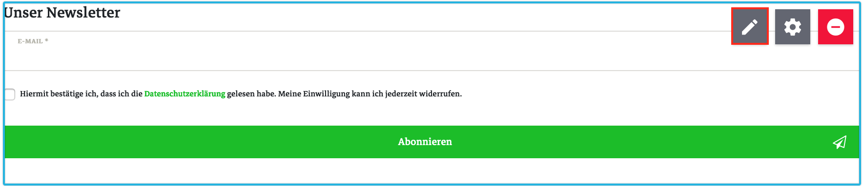
Highlight the text you want to edit in the inline editor to open the formatting options. The following formatting options are available:

| Option | Explanation |
|---|---|
Bold |
The selected text is formatted in bold font. |
Italic |
The selected text is formatted in italic font. |
Underline |
Underlines the selected text. |
Strikethrough |
The selected text is formatted as crossed out text. |
Headline |
The drop-down list provides 6 formatting options for titles, ranging from H1-H6, with which the selected text can formatted. Please note that the use of H1 titles can impact the SEO ranking. |
Link |
Opens an overlay in which you can define a link target for the selected text. Additionally, you can specify that the link target is opened in new tab upon clicking the selected text. |
Alignment |
Select whether the highlighted text left- or right-justified, centred or fully justified. |
List |
The highlighted text is formatted as a list of bullet points, in which the entries are marked with dots. |
Numbered list |
The highlighted text is formatted as a numbered list. |
Font colour |
Select the font colour of the highlighted text. You can select black or one of the 6 colours you have defined in the Design menu. |
Background colour of the text |
Select the background colour of the highlighted text. You can select white or one of the 6 colours you have defined in the Design menu. |
Translation key |
Opens an overlay in which you can enter a translation key. Translation keys are placeholders that are filled with content you specify in the Shop » Multilingualism menu. The format for the keys you enter here is Ceres::Template.keyName, whereas “keyName” should be replaced by the corresponding translation key. Please note that the translation keys are case sensitive and are written in camelCase; accordingly, the translation key for your GTC is Ceres::Template.termsAndConditions. |
When you are done editing your texts in the inline editor, apply the changes by clicking the green check mark in the upper right corner of the editor window. Do not forget to save your changes.
3.16.1. Data fields for single item pages
Since the release of Ceres 4.1, it is possible to insert item data fields with the inline editor. If you open the editor view of a content of the type item and open the inline editor of a widget, the navigational tree for item data fields will be displayed on the left side of the interface. The tree lists many useful item data fields that can be added to your texts. Uncollapse a section in the data field tree to show the corresponding data fields. Add a data field at the position of your cursor by clicking the data field in the navigation tree. If the data field is not specified for an item in the back end, no value is displayed in the online store.
Adding data fields to the item view:
-
Open a content for a single item view in the ShopBuilder editor.
-
Click on the Pencil icon () on a widget to open the inline editor. → The navigation tree for item information is displayed on the left side.
-
Expand an area in the navigation by clicking on its title.
-
Click on an item data field to insert it at the position of the cursor in the inline editor.
-
Save () the settings.
3.17. Paddings and margins
You can specify the paddings and margins of nearly all widgets. The widget settings include the 2 checkboxes Edit paddings and Edit margins. If you activate the checkboxes, new formatting options for paddings and margins will be displayed in the widget settings.
| Setting | Explanation |
|---|---|
Auto |
Default value. |
XS |
The spacing equates to 0,25 rem. |
S |
The spacing equates to 0,5 rem. |
M |
The spacing equates to 1 rem. |
L |
The spacing equates to 1,5 rem. |
XL |
The spacing equates to 3 rem. |
Custom |
Enter your own value for the upper margin. Select either px or rem as the spacing unit. |
4. Carry out design settings for plentyShop
When editing a content in the editor, you can click on the Design() button. This opens the design settings of ShopBuilder. In this menu, you carry out settings pertaining to the colour scheme and the fonts used in your online store.
4.1. Carry out colour settings in ShopBuilder
You can globally manage the colour scheme of all your pages in the ShopBuilder. The names of the 6 colour fields in the colour section are taken from the framework Bootstrap. You can define own colours for the 6 fields and access them via the drop-down list Appearance in most widgets.
Select colours
-
Go to Shop » ShopBuilder.
→ The content manager view of the ShopBuilder opens. -
Click on any content you created.
→ The editor view opens. -
Click on the Design button ) in the tool bar.
→ The Design menu opens. -
Carry out the settings in the Colours section. Pay attention to the explanations given in Table 72.
-
Save () the settings.
| Setting | Explanation |
|---|---|
Primary colour |
Select the primary colour of your plentyShop. It determines the colouring of the buttons in your shop. Select a colour via the colour picker or enter a hex value. |
Secondary colour |
This attribute changes the secondary colour of the online store. You can use this colour field in most widgets. Select a colour via the colour picker or enter a hex value. |
Success colour |
This attribute changes the colour of the success notifications in the online store. You can use this colour field in most widgets. Select a colour via the colour picker or enter a hex value. |
Information colour |
This attribute changes the colour of information notifications in the online store. You can use this colour field in most widgets. Select a colour via the colour picker or enter a hex value. |
Warning colour |
This attribute changes the colour of warning notifications in the online store. You can use this colour field in most widgets. Select a colour via the colour picker or enter a hex value. |
Danger colour |
This attribute changes the colour of error notifications in the online store. You can use this colour field in most widgets. Select a colour via the colour picker or enter a hex value. |
4.2. Editing fonts in the ShopBuilder
The ShopBuilder also offers the possibility of selecting individual fonts for the online store. You can either enter the URL of a font or upload a font file. These fonts are used globally in your plentyShop.
Adding a font:
-
Go to Shop » ShopBuilder.
→ The content manager view of the ShopBuilder opens. -
Click on any content you created.
→ The editor view opens. -
Click on the Design button in the tool bar.
→ The Design menu opens. -
Carry out the settings in the Fonts section. Pay attention to the information given in Table 73.
-
Save () the settings.
| Option | Explanation |
|---|---|
Enter font URL |
Enter a URL in the respective fields (regular, bold, italic or bold-italic). |
Upload font |
You require a font file on your computer. Select the font file you want to use in the respective fields (regular, bold, italic or bold-italic). |
5. ShopBuilder workflow for creating new pages
Follow these steps to create new pages and display them in the online store.
-
Select the plugin set, the language, and the client in the content manager view.
-
Select the category for which you want to create a new page.
-
Create a new content by clicking New.
-
Click the newly created content to open the editor view.
-
Add widgets to the page and carry out the widget settings.
-
Save () your changes.
-
Activate the content in the content manager view to make the page available in your online store.