Dashboard
In the constantly changing world of e-commerce, it is essential to keep an overview of the numbers and data of your online business. Thus, PlentyONE offers you a dashboard that enables you to access the current key figures of your company and decide if further action is needed.
A default view with most of the information is pre-configured on all systems. The default view can be used as a template to configure other views according to your needs, both in terms of content and display options.
You can also create your individual dashboard by combining various key figures, statistics, graph types and format options. The dashboard allows you to be as flexible and creative as you like.
Especially when creating your first dashboard view, there are some points to consider. First, carry out the preparatory settings and follow the instructions in the following chapters carefully:
1. Carrying out the preparatory settings
Only a few preparatory steps are necessary before you can set up your individual dashboard view. These settings are described in the following chapters.
1.1. Creating key figure configurations
To display data on your dashboard, you need to create the corresponding key figure configurations first.
Key figures essentially allow you to create different data sets. This way, key figures are a basis for the values and data that you can then display and track on your dashboard. Your PlentyONE system provides so-called dimensions for each key figure. Dimensions determine the criteria that are used to group the data included in the key figure. This way, you can precisely define the conditions for the calculation of each key figure.
You can either create key figures in the Setup » plentyBI » Key figure configurations menu or directly from the dashboard. Both methods are described below.
If users without admin access to your PlentyONE system should be allowed to create key figure configurations, assign the necessary user rights first.
Note that some key figure configurations can only be used if you have booked the corresponding plentyBI edition. Go to PlentyONE logo (Start) » My account » Contracts. Click on Edit contract and go to the step Choose plentyBI edition. Here, you can choose between plentyBI editions with various scopes. In addition, more precise information on the required plentyBI edition is displayed for each key figure configuration when you set it up in the Setup » plentyBI » Key figure configurations menu.
|
Default key figures available
The key figures Orders, Orders (Live), Items below reorder level (Live), Revenue, Cloud usage and Traffic usage are so-called default key figures. This means that they are already set up in your PlentyONE system with some preparatory settings. This way, you can get on with the setup much quicker. You can use these key figures free of charge. Go to Setup » plentyBI » Key figure configurations and click on the desired key figure configuration to adjust the predefined settings according to your needs. Afterwards, you can start with integrating these key figures on your dashboard. |
This method is especially useful if you want to create a high number of key figures configurations at once. Table 1 contains a list of available key figure settings. Click on the respective link for more detailed information on setting up the key figure configuration and carrying out the available settings.
Creating key figure configurations in the setup menu:
-
Go to Setup » plentyBI » Key figure configurations.
-
Carry out the settings according to Table 1.
-
Save () the settings.
| Setting | Explanation |
|---|---|
Name |
Enter a name for the key figure configuration. |
Key figure |
Select the key figure you want to create. For further information, refer to the Key figures page of the manual. |
Calculation type |
Decide in more detail how the results of the key figure should be calculated. For example, if you select the key figure Revenue, you can decide here if the revenue is calculated in gross or net. |
Dimension |
This setting determines the criteria for creating the data basis for the calculation of the key figure. |
Result unit |
Select which unit should be applied to the results of the key figure. This setting has no influence on the actual calculation of the key figure results, but affects the text for the unit that will later be displayed on the dashboard elements for this key figure. |
ID |
After you have created a key figure configuration, this field displays an ID assigned by the system. This ID cannot be edited. |
Updated on |
The time at which the key figure configuration was edited last. |
Created on |
The time at which the key figure configuration was created. |
Created by |
The user name of the user who has created the key figure configuration. Click on the lock next to the name to lock the key figure configuration. This way, only the user who has created the key figure configuration can make changes to it. |
Comment |
If needed, enter a comment for the key figure. This comment is saved with the key figure configuration and can help to provide you and your employees with specific information on the key figure. |
Target values section |
|
for days and weeks, for months, for quarters, for years |
Enter target values that should be reached by the key figure. Depending on the desired period of time, you can make flexbile entries for the target values you are planning for the key figure. |
Do you want to add key figure configurations to a new or already existing dashboard? Then proceed as described below.
- Creating key figure configurations from the dashboard
-
-
Go to PlentyONE logo (Start) » Dashboard.
-
Click on Edit view ().
→ The settings menu opens. -
Drag-and-drop an element from the settings menu on the dashboard.
-
Move the cursor over the element and click on ().
→ The settings menu for the element opens. -
Drag-and-drop an element within the section outlined in blue.
-
Move the cursor over the element and click on ().
-
In the settings menu, click on Key figure configuration and select the option Create new key figure configuration.
→ A window for setting up the new key figure configuration opens. -
Enter a *name*for the key figure configuration.
-
Carry out the settings according to Table 1.
-
Click on Save ().
-
1.2. Editing key figure configurations
Later on, it may become necessary to edit key figure configurations that you have already created. After you have carried out changes, the data provided by this key figure are updated automatically, so that you can quickly view up-to-date results on your dashboard.
You can either edit key figures in the Setup » plentyBI » Key figure configurations menu or directly from the dashboard. Both methods are described below.
This method is especially useful if you want to edit a high number of different key figures at once.
Editing key figure configurations in the setup menu:
-
Go to Setup » plentyBI » Key figure configurations.
-
Open the key figure configuration that you want to edit.
-
Carry out the desired changes.
-
Save () the settings.
Do you want to edit key figures from a new or already existing dashboard? Then proceed as described below.
- Editing key figure configurations from the dashboard
-
-
Go to PlentyONE logo (Start) » Dashboard.
-
Click on Edit view ().
-
Click on Edit () on the upper right side of a section.
-
Click on Edit (*) on the upper right side of an element that displays the key figure configuration to be edited.
→ The settings menu for the element opens. -
Click on Edit key figure configuration (edit) to the right of the option Key figure configuration.
→ The key figure configuration opens in the Setup » plentyBI » Key figure configurations menu. -
Carry out the desired changes.
-
Save () the settings.
→ You are forwarded back to the dashboard.
-
1.3. Assigning rights
When working with key figures, you should decide which of your employees should be allowed to view which key figure configurations. Users with admin access to your PlentyONE system can view all key figure configurations and create new key figure configurations by default. Users without an admin account have to be assigned those rights by a user with an admin account.
Proceed as described below to determine which key figure configurations should be visible for users.
Assigning rights for viewing key figure configurations:
-
Open the menu Setup » Account management » Roles.
→ The detail view opens. -
Click on Search () to search for roles.
-
Open the desired role.
-
Click on Access rights.
-
Click on key figure configurations.
-
Activate all key figure configurations that should be visible for the user.
_Optional:* Click on ALL if all existing key figure configurations should be visible for the user. -
Save () the settings.
Do you want to allow employees without admin access to your system to create key figure configurations? Then carry out the following additional settings.
Assigning rights for users without admin accounts
Users with roles that are not of the type Administrator can only see certain sections and menus in PlentyONE. This means they only have limited access to the system. If employees can create key figure configurations, they need at least the following rights:
-
plentyBI > Key figure configurations > Read
Note that only users with roles of the type Administrator can grant rights.
Assigning rights:
-
Open the menu Setup » Account management » Roles.
→ The roles overview opens. -
Click on New (add).
→ The role creation menu opens. -
Enter a name for the role.
-
Switch to the advanced mode by toggling Advanced (toggle_on) slider.
-
Assign the rights for the respective section by ticking the check boxes indicated above.
Note: You can either grant rights for complete sections or limit the rights you grant the user. To only grant limited rights in a certain section, expand the section. -
Save (save) the settings.
|
The simple mode and advanced mode are connected. If you check menu visibilities in the simple mode the corresponding permissions in the advanced mode will be checked automatically. The connection only exists in this direction. If you check permissions in the advanced mode no menu or plugin visibilities will be checked automatically. |
2. Setting up a dashboard view
2.1. Default view
Your system comes pre-configured with a default dashboard view, equipped with familiar functionalities from the old dashboard. This serves as a starting point for tailoring your dashboard to meet your specific needs in terms of content and display options.
2.1.1. Exploring the default view
In the default view of the dashboard you can find important business data conveniently displayed. Some of the key elements found in the default view can be seen in Table 2.
| Element | Explanation |
|---|---|
Payment overview |
This element gives you an overview of the quantity and the status of the payments in your system. If you click on the entries highlighted in blue in the Dimension column, the respective orders are displayed in a new tab in the Orders » Payments menu. |
Orders and status |
Expand this element () to view orders separated by order status. Click on blue entries in the Dimension column to access specific orders in the Orders » Orders menu. |
Item(s) below reorder level |
Expand this element () to see which items and variations are below the determined reorder level and should thus be reordered soon. If you click on the entries highlighted in blue in the Dimension column, the respective items or variations are opened in a new tab in the Stock » Stocks menu. |
2.2. Setting up a new dashboard view
As soon as you have carried out the preparatory settings, you are ready to set up your dashboard.
The first steps on a new dashboard always consist of placing different sections for display on the dashboard. Then, you fill these sections with data that can be displayed in the form of different elements. You can add and individually position several elements per section.
In addition to the default view available in the PlentyONE logo (Start) » Dashboard menu, you can create and save additional individual views. Depending on how detailed the visualisation of data on your dashboard should be, you can create separate views for different topics and data.
|
User rights for creating new dashboards
New dashboard views can only be set up by users whose role was assigned the Create right under View set in the simple mode. |
Setting up a new dashboard view:
-
Go to PlentyONE logo (Start) » Dashboard.
-
Click on Default view in the upper right corner.
-
Click on Create new preset.
-
Assign a Name for the view.
-
Click on Create view.
→ The new view opens. By default, a new view is always a copy of the view that you have created before. Use the editing mode to delete elements that are not needed and to add further elements to the newly created view. -
Save () the settings.
→ The new view is saved.
For each dashboard view, you can restrict access to certain users or user roles. Refer to the following chapter for more information.
2.3. Using the editing mode
|
Deleting the default view
The default view cannot be edited or deleted. However, non-admin users granted editing rights can make changes based on the default view, saving a modified version as a new view while preserving the original structure. New views can only be created by administrators. |
You can position sections for content and elements on the dashboard intuitively via drag-and-drop. Use the editing mode () to further adjust sections or elements or undo changes, if needed.
The editing mode allows a high degree of flexibility for positioning content and data in the menu. This works by intuitively positioning elements via drag-and-drop. You can individually adjust and edit each element. Table 3 contains an overview of the functions available in the editing mode.
|
Do you have admin rights?
Only admin users can create and edit views. If you are not an admin:
|
Element |
Symbol |
Explanation |
Edit view |
Opens the view for editing. |
|
Undo |
undo |
Undoes the last change, unless this change has already been saved. |
Redo |
redo |
Restores the previously undone change. |
Default view |
This area displays the view that is currently opened. Click on to switch to another view or to create a new view. |
|
Restoring the previously saved state |
restore |
Resets the view to the state that was last saved. |
Save |
save |
Saves the changes. By doing so, you can save as many different views as you like. |
Edit |
edit |
When you edit the element, you can see in the Elements area on the right side which elements have not been added yet and are therefore still available. Elements that have already been added are disabled and cannot be used another time. |
Delete |
delete |
Deletes the element. |
Close |
close |
Closes the editing mode. If you have not saved the changes yet, a security inquiry appears. |
2.4. Assigning rights for dashboard views
Decide which users should see the default view. You can also restrict or allow access for additional dashboard views per user or user role. Note that users without admin accounts cannot edit dashboard views or create new views, even if they have been assigned those rights.
|
Hiding the default view
The default view can be hidden for non-admin users if alternative custom views exist. Activate a custom view for the desired user role and deactivate the default view to ensure at least one view remains active per role. |
Open the editing mode () for an already existing dashboard view. Click on Rights management to access the settings for users and user roles and decide which dashboard view(s) should be visible for them.
Additional information and instructions on how to assign rights to roles are available on the xref;business-decisions:user-accounts-access.adoc#[User accounts and access] page of the manual.
2.5. Determining visibility of dashboard views
In addition to assigning rights for dashboard views, there are further possibilities to determine the visibility of dashboard views in the side navigation on the left margin of the PlentyONE logo (Start) » Dashboard menu.
As a logged in user, you can easily see which dashboard views you can access and quickly switch between them. In the PlentyONE logo (Start) » Dashboard menu, click on the menu icon on the left (). A list of dashboard views that have been made visible to you opens. Click on a dashboard view to open it. The currently opened dashboard view is displayed in blue on the list.
|
Take note of rights for dashboard views
The functionalities described here do not influence the rights that have been assigned to individual users. Rather, they determine how already existing dashboard views are displayed and accessed in the side navigation. Make sure that the users of your system have the respective rights for dashboard views or, depending on the case, are not assigned rights if they should not have access to certain content. |
Determining visibility of dashboard views:
-
Open the editing mode () for an already existing dashboard view.
-
Activate the option Expand side navigation and/or Hide from side navigation. Pay attention to the information provided in Table 4.
Note: These options are only visible to admin users and can only be carried out by them. -
Save () the settings.
| Setting | Explanation |
|---|---|
Expand side navigation |
If this option is activated, the side navigation on the left margin of the PlentyONE logo (Start) » Dashboard menu is expanded every time the menu is opened. This setting takes effect for all users. The side navigation lists all existing dashboard views to which the respective user has been granted access rights and for which the option Hide from side navigation has not been activated. |
Hide from side navigation |
Should the dashboard view be excluded from the side navigation? Then activate this option. |
3. Adding and using dashboard elements
|
Function only available for admins
Dashboard elements can only be added by users of the type Admin. However, users without admin accounts may be able to see the added elements later if they have been assigned the necessary rights for dashboard views. |
The dashboard offers you different possibilities to display key figures and other important information. Thus, you can visualise data in the exact way you need. The following types of elements are available:
The process of placing an element on the dashboard is always the same, regardless of the element type. The following instructions explain how it works.
Placing sections and elements on the dashboard:
-
Go to PlentyONE logo (Start) » Dashboard.
-
Click on Edit view ().
-
Drag-and-drop an element from the settings menu on the dashboard.
-
Move the cursor over the element and click on Edit ().
→ The settings menu opens.
→ The possible elements for the section are displayed. -
Select an element from the settings menu and drag-and-drop it within the section on the dashboard.
-
Save () the settings.
|
Collapse sections on the dashboard
Have you placed a lot of sections on your dashboard and want to keep the overview? The option Collapse section is available for each section. Activate this option to collapse the section on the dashboard by default. Click on () to open the section and see the data displayed within whenever needed. |
The following chapters describe how to use the different elements and which settings are possible for each element.
3.1. Tiles
Tiles are simple square sections. Data in tiles is displayed exclusively as text and numbers. You can select different colours and settings for time intervals and target values.
3.1.1. Carrying out settings for tiles
First, add an element of the type Tile to the dashboard. Then, use the options described in Table 5 to carry out individual settings for the tile.
Placing areas and elements on the dashboard:
-
Go to PlentyONE logo (Start) » Dashboard and click on Edit view ().
-
Select an element from the settings menu and place it on the dashboard by using Drag-and-drop.
Note: If you have already placed an area for the element on the dashboard, you do not have to add it again. In this case, drag-and-drop the desired element to the existing area and click on Edit () at the top right corner of the element. -
Move the cursor over the element and click on Edit ().
→ The settings menu opens.
→ The possible elements for the area are displayed. -
Select an element from the settings menu and drag-and-drop it within the area on the dashboard.
-
Save () the settings.
| Setting | Explanation |
|---|---|
Tile configuration templates |
Click on this button to use a tile configuration template provided by the system. This way, the tile displays the selected data so you do not have to select data manually in additional steps. |
Key figure |
Use the search field to enter the name of the key figure configuration and select an entry to display the key figure on the tile. Alternatively, click on Create new key figure configuration () to create a new key figure configuration. |
Title |
Enter an appropriate title for the tile. The title is displayed as name on the tile. Click on () if no title should be displayed. |
Period |
Select the period of time for which the data of the selected key figure configurations should be considered. |
Aggregate |
Decide how the key figure results calculated by the system for the selected period should be combined with each other. |
Time interval |
This setting narrows down the values of the selected Period. Thus, the time interval always has to be shorter than the selected Period. |
Primary value |
The primary value is displayed a little bigger than the Secondary value on the tile. For this option, you can select the simple Key figure result or the difference (Delta) between the actual value and the target value defined in the key figure configuration. You can display the difference (delta) as an absolute value or as a Percentage. Click on (settings) to determine how many decimal places should be displayed for the value. |
Secondary value |
This value is displayed smaller than and above the primary value. The settings available for the secondary value are identical to the ones available for the Primary value. Select the option None if no secondary value should be displayed on the tile. |
Target |
Do you want to display the target value defined in the key figure configuration on the tile? Select one of the options Display or Do not display. |
Unit |
Decide if the unit of the key figure should be displayed on the tile. |
Display time reference |
Do you want to display the period of time to which the calculated value refers on the tile? Select one of the options Display period or Display time interval to permanently display the previously selected Period or Time interval at the bottom left of the tile. Select Do not display if no time reference should be displayed on the tile. |
Conditional colouring |
Do you want to display the tile in a particular colour? Select the option Display and click on (settings). A settings window opens. On the left, select the colour for the tile. If you want the colour of the tile to change according to the value of the key figure, select an Operator and enter a Comparison value before clicking on Save.
|
Custom shortcuts |
Use this setting to add a customised option to the Actions (more_vert) menu on the tile. You can also determine conditions that have to be fulfilled for the option to be displayed, and decide what happens if users click on the option. |
Link to detailed dashboard view |
Select which already existing dashboard view should be opened when users click on the Actions menu (more_vert) on the tile and select the option Tile details. |
Parameters for detailed view |
Have you selected an already existing dashboard view for the setting Link to detailed dashboard view? Then use this setting to determine how the data included in the dashboard view will be filtered. Click on Parameter configuration (settings) to determine one or more criteria. Depending on the key figure represented on the tile, the parameters Country of delivery, User or Message tag are available. |
3.1.2. Viewing or exporting tile data
Do you want to take a closer look at the data displayed on the tile or export the data? Then proceed as described below.
Viewing or exporting tile data:
-
Move your cursor over the tile whose data you want to view or export.
-
Click on Actions (more_vert).
→ The context menu opens. Pay attention to the information provided in Table 6.
| Setting | Explanation |
|---|---|
Tile details |
Depending on the setting that you have carried out for the Link to detailed dashboard view option, either a default view defined by the system or the dashboard view that you have selected opens. |
Raw data |
This option displays the key figure configuration(s) that the tile is based on. Click on the name to open another view that contains the current results of the raw data in more detail. |
Export to Google Sheets |
Use this option to export the tile data to a Google sheet. |
3.2. Rows
You can display the data of key figures as individual lines on the dashboards. If needed, you can place several rows to display more information.
3.2.1. Carrying out settings for rows
First, add an element of the type Row to the dashboard. Then, use the options described in Table 7 to carry out individual settings for the row.
Placing areas and elements on the dashboard:
-
Go to PlentyONE logo (Start) » Dashboard and click on Edit view ().
-
Select an element from the settings menu and place it on the dashboard by using Drag-and-drop.
Note: If you have already placed an area for the element on the dashboard, you do not have to add it again. In this case, drag-and-drop the desired element to the existing area and click on Edit () at the top right corner of the element. -
Move the cursor over the element and click on Edit ().
→ The settings menu opens.
→ The possible elements for the area are displayed. -
Select an element from the settings menu and drag-and-drop it within the area on the dashboard.
-
Save () the settings.
Carrying out settings for rows:
-
Click on Edit () in the top right corner of the row.
→ The settings menu opens. -
Carry out the settings for the row.
-
Save () the settings.
| Setting | Explanation |
|---|---|
Key figure |
Use the search field to enter the name of the key figure configuration and select an entry to display the key figure in the row. Alternatively, click on Create new key figure configuration () to create a new key figure configuration. |
Title |
Enter an appropriate title. The title will be displayed as the name within the row. Click on () if no title should be displayed. |
Period |
Select the period of time for which the data of the selected key figure configurations should be considered. |
Time interval |
This setting narrows down the values of the selected Period. Thus, the time interval always has to be shorter than the selected Period. |
Primary value |
The primary value is displayed a little bigger than the Secondary value on the tile. For this option, you can select the simple Key figure result or the difference (Delta) between the actual value and the target value defined in the key figure configuration. You can display the difference (delta) as an absolute value or as a Percentage. Click on (settings) to determine how many decimal places should be displayed for the value. |
Secondary value |
This value is displayed smaller than and above the primary value. The settings available for the secondary value are identical to the ones available for the Primary value. Select the option None if no secondary value should be displayed on the tile. |
Target |
Do you want to display the target value defined in the key figure configuration on the tile? Select one of the options Display or Do not display. |
Unit |
Decide if the unit of the key figure should be displayed in the row. |
Conditional colouring |
Do you want to display the row in a particular colour? Select the option Display and click on (settings). A settings window opens. On the left, select the colour for the row. If you want the colour of the tile to change according to the value of the key figure, select an Operator and enter a Comparison value before clicking on Save.
|
Custom shortcuts |
Use this setting to add a customised option to the Actions (more_vert) menu next to the row. You can also determine conditions that have to be fulfilled for the option to be displayed, and decide what happens if users click on the option. |
Link to detailed dashboard view |
Select which already existing dashboard view should be opened when users click on the Actions (more_vert) menu next to the row and select the option Tile details. |
Parameters for detailed view |
Have you selected an already existing dashboard view for the setting Link to detailed dashboard view? Then use this setting to determine how the data included in the dashboard view will be filtered. Click on Parameter configuration (settings) to determine one or more criteria. Depending on the key figure represented by the row, the parameters Country of delivery, User or Message tag are available. |
3.2.2. Viewing row data
Proceed as described below to view row data in more detail.
Viewing row data:
-
Move your cursor over the row whose data you want to view.
-
Click on Actions (more_vert).
→ The context menu opens. Pay attention to the information provided in Table 8.
| Setting | Explanation |
|---|---|
Row details |
Depending on the setting that you have carried out for the Link to detailed dashboard view option, either a default view defined by the system or the dashboard view that you have selected opens. |
Raw data |
This option displays the key figure configuration(s) that the row is based on. Click on the name to open another view that contains the current results of the raw data in more detail. |
3.3. Tables
To provide an easy overview of data, you can display data on the dashboard as tables. In addition, you can decide which values are displayed and how values are sorted within the table.
3.3.1. Carrying out settings for tables
First, add an element of the type Table to the dashboard. Then, use the options described in Table 9 to carry out individual settings for the table.
Placing areas and elements on the dashboard:
-
Go to PlentyONE logo (Start) » Dashboard and click on Edit view ().
-
Select an element from the settings menu and place it on the dashboard by using Drag-and-drop.
Note: If you have already placed an area for the element on the dashboard, you do not have to add it again. In this case, drag-and-drop the desired element to the existing area and click on Edit () at the top right corner of the element. -
Move the cursor over the element and click on Edit ().
→ The settings menu opens.
→ The possible elements for the area are displayed. -
Select an element from the settings menu and drag-and-drop it within the area on the dashboard.
-
Save () the settings.
Carrying out settings for tables:
-
Click on Edit () in the top right corner of the table.
→ The settings menu opens. -
Carry out the settings for the table.
-
Save () the settings.
| Setting | Explanation |
|---|---|
Table configuration templates |
Click on this button to use a table configuration template provided by the system. This way, the table displays the selected data so you do not have to select data manually in additional steps. |
Key figure |
Use the search field to enter the name of the key figure configuration and select an entry to display the key figure in the table. Alternatively, click on Create new key figure configuration () to create a new key figure configuration. |
Title |
Enter an appropriate title. The title will be displayed as a name on the table. Click on () if no title should be displayed. |
Period |
Select the period of time for which the data of the selected key figure configurations should be considered. |
Time interval |
This setting narrows down the values of the selected Period. Thus, the time interval always has to be shorter than the selected Period. |
Sorting |
Decide how the individual values should be sorted within the table. To do so, first activate one or several of the options Primary result, Scale basis or dimensions. Then, select one of the options Descending or Ascending for the previously selected options. |
Items per page |
Depending on the number of entries, the table can be displayed on several pages. Select if 10, 25, 50, 75 or 100 entries should be displayed per page. |
Group by dimension |
If you activate this option, multiple entries of the same dimension are collapsed into one entry. |
Mapped column |
Every column that you map here corresponds to one column in the table. For every column, select one of the options Calculation date, Dimension, Primary result, Result unit, Scale basis or Target. This way, you can determine which values are displayed in the table. If you do not wish to display one of this options, such as the calculation date, do not assign the column. |
Decimal places |
Determine how many decimal places should be displayed for the result of the key figure. Select the option 0 if no decimal place should be displayed. You can display a maximum of 4 decimal places. |
Conditional colouring |
Do you want to display the table in a particular colour? Select the option Display and click on (settings). A new settings window opens. On the left, select the colour for the table. If you want the colour of the table to change according to the value of the key figure, select an Operator and enter a Comparison value before clicking on Save. |
Display primary result 0 |
Activate this option to also include values whose result is 0 in the table. |
3.3.2. Viewing and exporting table data
After you have placed a table on the dashboard, several options are available to view the data in more detail and export the data, if required.
Viewing and exporting table data:
-
Click on (more_vert) in the top right corner of the table.
→ The context menu opens. -
Select which action you want to carry out for the table. Table 10 explains the available options.
| Option | Explanation |
|---|---|
Raw data |
This option displays the key figure configuration(s) that the table is based on. Click on the name to open another view that contains the current results of the raw data in more detail. |
Export to Google Sheets |
Use this option to export the table data to a Google sheet. |
CSV export |
Select this option to download the data of the table as a CSV file. The download starts automatically as soon as you have clicked on this button. |
3.4. Combined tables
Combined tables allow you to display the results of several key figures next to each other in one single table.
3.4.1. Carrying out settings for combined tables
First, add an element of the type Combined table to the dashboard. Then, use the options described in Table 11 to carry out individual settings for the combined table.
Placing areas and elements on the dashboard:
-
Go to PlentyONE logo (Start) » Dashboard and click on Edit view ().
-
Select an element from the settings menu and place it on the dashboard by using Drag-and-drop.
Note: If you have already placed an area for the element on the dashboard, you do not have to add it again. In this case, drag-and-drop the desired element to the existing area and click on Edit () at the top right corner of the element. -
Move the cursor over the element and click on Edit ().
→ The settings menu opens.
→ The possible elements for the area are displayed. -
Select an element from the settings menu and drag-and-drop it within the area on the dashboard.
-
Save () the settings.
Carrying out settings for combined tables:
-
Click on Edit () in the top right corner of the combined table.
→ The settings menu opens. -
Carry out the settings for the combined table.
-
Save () the settings.
| Setting | Explanation |
|---|---|
Title |
Enter an appropriate title. The title will be displayed as a name on the combined table. Click on () if no title should be displayed. |
Key figures and period |
Click on () to select the key figures that should be displayed in the combined table. A new settings window opens. Click on () to select further key figure configurations to be displayed in the table. For each key figure configuration that you select here, you can determine the Sorting and the Period for displaying the data in the table. If needed, you can also enter an individual Title for each key figure configuration. |
Time interval |
This setting narrows down the values of the selected Period. Thus, the time interval always has to be shorter than the selected Period. |
Group by dimension |
If you activate this option, multiple entries of the same dimension are collapsed into one entry. |
Mapped column |
Every column that you map here corresponds to one column in the table. For every column, select one of the options Calculation date, Dimension, Primary result, Result unit, Scale basis or Target. This way, you can determine which values are displayed in the table. If you do not wish to display one of this options, such as the calculation date, do not assign the column. |
Items per page |
Depending on the number of entries, the table can be displayed on several pages. Select if 10, 25, 50, 75 or 100 entries should be displayed per page. |
Conditional colouring |
Do you want to display the table in a particular colour? Select the option Display and click on (settings). A new settings window opens. On the left, select the colour for the table. If you want the colour of the table to change according to the value of the key figure, select an Operator and enter a Comparison value before clicking on Save. |
3.4.2. Viewing and exporting combined table data
After you have placed a combined table on the dashboard, several options are available to view the data in more detail and export the data, if required.
Viewing and exporting combined table data:
-
Click on (more_vert) in the top right corner of the table.
→ The context menu opens. -
Select which action you want to carry out for the table. Table 12 explains the available options.
| Option | Explanation |
|---|---|
Export to Google Sheets |
Use this option to export the table data to a Google sheet. |
3.5. Graphs
Graphs allow you to visualise data on your dashboard in an even clearer way. The following types of graphs are available:
The following chapters explain how to place the different types of graphs on your dashboard and which settings are available for each type.
In addition, some few useful additional functions are available for all graphs types. For example, you can download graphs as images or easily access the data displayed in the graph directly from the dashboard. Refer to the chapter Using additional functions for graphs for more information.
3.5.1. Pie chart
You can use the pie chart to display the results of multiple key figures as a distinctive part of the chart.
First, add an element of the type Pie chart to the dashboard. Then, use the options described in Table 13 to carry out individual settings for the pie chart.
Placing areas and elements on the dashboard:
-
Go to PlentyONE logo (Start) » Dashboard and click on Edit view ().
-
Select an element from the settings menu and place it on the dashboard by using Drag-and-drop.
Note: If you have already placed an area for the element on the dashboard, you do not have to add it again. In this case, drag-and-drop the desired element to the existing area and click on Edit () at the top right corner of the element. -
Move the cursor over the element and click on Edit ().
→ The settings menu opens.
→ The possible elements for the area are displayed. -
Select an element from the settings menu and drag-and-drop it within the area on the dashboard.
-
Save () the settings.
Carrying out settings for pie charts:
-
Click on Edit () in the top right corner of the pie chart.
→ The settings menu opens. -
Carry out the settings for the pie chart.
-
Save () the settings.
| Setting | Explanation |
|---|---|
Key figure |
Use the search field to enter the name of the key figure configuration and select the entries to display the key figures in the pie chart. Alternatively, click on Create new key figure configuration () to create a new key figure configuration. |
Title |
Enter an appropriate title for the tile. The title is displayed as name on the pie chart. Click on () if no title should be displayed. |
Period |
Select the period of time for which the data of the selected key figure configurations should be considered. |
Time interval |
This setting narrows down the values of the selected Period. Thus, the time interval always has to be shorter than the selected Period. |
3.5.2. Bar chart and line graph
Bar charts and line graphs are also commonly used for visualising data. They are particularly suited for clear visualisations of how values develop over time. This is why you can select several key figures to display them in those types of graphs.
The available settings for bar charts and line graphs are mostly identical. Thus, they are both described in this chapter. Exceptions and limited availabilities are clearly pointed out in the following explanations.
First, add an element of the type Bar chart or Line graph to the dashboard. Then, use the options described in Table 14 to carry out individual settings for charts.
Placing areas and elements on the dashboard:
-
Go to PlentyONE logo (Start) » Dashboard and click on Edit view ().
-
Select an element from the settings menu and place it on the dashboard by using Drag-and-drop.
Note: If you have already placed an area for the element on the dashboard, you do not have to add it again. In this case, drag-and-drop the desired element to the existing area and click on Edit () at the top right corner of the element. -
Move the cursor over the element and click on Edit ().
→ The settings menu opens.
→ The possible elements for the area are displayed. -
Select an element from the settings menu and drag-and-drop it within the area on the dashboard.
-
Save () the settings.
Carrying out settings for bar charts and line graphs:
-
Click on Edit () in the top right corner of the bar chart or line graph.
→ The settings menu opens. -
Carry out the settings for the bar chart or line graph.
-
Save () the settings.
| Setting | Explanation |
|---|---|
Bar chart configuration templates / Line graph configuration templates |
Click on this button to use a template for the chart or graph provided by the system. This way, the chart or graph displays the selected data so you do not have to select data manually in additional steps. |
Key figures and period |
Use the search field to enter the name of the key figure configuration and select the entries to display the key figures in the chart or graph. Alternatively, click on Create new key figure configuration () to create a new key figure configuration. |
Time interval |
This setting narrows down the values of the selected Period. Thus, the time interval always has to be shorter than the selected Period. |
Additional time interval |
This setting displays additional buttons on the top right of the bar chart or line graph. These buttons allow you to filter the data displayed in the graph according to additional time intervals. This way, you can easily switch between different time intervals. Activate one or more of the options Day, Month, Quarter or Year. |
Click on bar for precise time interval (only available for bar charts) |
Activate this option to display the data of the bar chart for the next smaller time interval. You can click on the bar repeatedly, until the smallest time interval (days) has been reached. Use the button Reset interval on the top right of the diagram to quickly return to the original display of data. |
Number of columns |
Select how many units of the selected time interval should be displayed in the graph or chart. The starting point depends on the selected time period. |
Activate zoom |
Activate this option to enable the zoom function for the graph or chart. In addition, determine a Start value to which the zoom should be set by default whenever the dashboard is opened. If you access the dashboard later, a blue bar with a control element will be displayed. Use this to zoom in and out of the graph or chart to see more detailed data, if needed. |
Display average line (only available for bar charts) |
Activate this option to display a line that represents the average values in addition to the bars. The average values are calculated from the results of the key figures that have been selected for display in the chart. |
Display horizontally (only available for bar charts) |
Activate this option to rotate the bar chart by 90 degrees. This automatically inverts the axes of the the bar chart. |
|
Quickly show and hide key figures
Especially if you display a high number of key figure configurations within a bar graph or line chart, you can quickly lose track of all the data. You can quickly hide the bars or lines for individual key figure configurations by clicking on the key figure configuration name displayed below the graph or chart. Click again to make the data visible again. |
3.5.3. Heat map
The heat map is a simplified visualisation based on a graph structure in the background. Heat maps display changing colours based on the current value of the key figure. This allows you to identify a possible need for action for the selected key figure configuration.
First, add an element of the type Heat map to the dashboard. Then, use the options described in Table 15 to carry out individual settings for the heat map.
Placing areas and elements on the dashboard:
-
Go to PlentyONE logo (Start) » Dashboard and click on Edit view ().
-
Select an element from the settings menu and place it on the dashboard by using Drag-and-drop.
Note: If you have already placed an area for the element on the dashboard, you do not have to add it again. In this case, drag-and-drop the desired element to the existing area and click on Edit () at the top right corner of the element. -
Move the cursor over the element and click on Edit ().
→ The settings menu opens.
→ The possible elements for the area are displayed. -
Select an element from the settings menu and drag-and-drop it within the area on the dashboard.
-
Save () the settings.
Carrying out settings for heat maps:
-
Click on Edit () in the top right corner of the heat map.
→ The settings menu opens. -
Carry out the settings for the heat map.
-
Save () the settings.
| Setting | Explanation |
|---|---|
Key figures and period |
Use the search field to enter the name of the key figure configuration and select an entry to display the key figure in the heat map. Alternatively, click on Create new key figure configuration () to create a new key figure configuration. |
Time interval |
This setting narrows down the values of the selected Period. Thus, the time interval always has to be shorter than the selected Period. |
X-axis |
Select the data basis that should be used for the x-axis. The options Scale basis, Dimension and Calculation date are available. |
Y-axis |
Select the data basis that should be used for the y-axis. The options Scale basis, Dimension and Calculation date are available. |
3.5.4. Progress chart
The progress chart displays multiple key figures as part of a single bar. This way, you can clearly display the shares of the key figures and see the proportions between the different values at one glance.
First, add an element of the type Progress chart to the dashboard. Then, use the options described in Table 16 to carry out individual settings for the progress chart.
Placing areas and elements on the dashboard:
-
Go to PlentyONE logo (Start) » Dashboard and click on Edit view ().
-
Select an element from the settings menu and place it on the dashboard by using Drag-and-drop.
Note: If you have already placed an area for the element on the dashboard, you do not have to add it again. In this case, drag-and-drop the desired element to the existing area and click on Edit () at the top right corner of the element. -
Move the cursor over the element and click on Edit ().
→ The settings menu opens.
→ The possible elements for the area are displayed. -
Select an element from the settings menu and drag-and-drop it within the area on the dashboard.
-
Save () the settings.
Carrying out settings for progress charts:
-
Click on Edit () in the top right corner of the progress chart.
→ The settings menu opens. -
Carry out the settings for the progress chart. The chapter on pie charts contains further information on the available options.
-
Save () the settings.
| Setting | Explanation |
|---|---|
Key figure |
Use the search field to enter the name of the key figure configuration and select the entries to display the key figures in the progress chart. Alternatively, click on Create new key figure configuration () to create a new key figure configuration. |
Title |
Enter an appropriate title. The title is displayed as name on the progress chart. Click on () if no title should be displayed. |
Period |
Select the period of time for which the data of the selected key figure configurations should be considered. |
Time interval |
This setting narrows down the values of the selected Period. Thus, the time interval always has to be shorter than the selected Period. |
3.5.5. Gauge chart
Gauge charts are especially suited for displaying the degree to which a specific target has already been reached. The target as well as the current value of the key figure are both represented with different colours and separated by a line.
|
Save target values
Before setting up a gauge chart, make sure that target values are saved for the respective key figure configuration and the time intervals that should be represented. Otherwise, the chart will not display the data properly. |
First, add an element of the type Gauge chart to the dashboard. Then, use the options described in Table 17 to carry out individual settings for the gauge chart.
Placing areas and elements on the dashboard:
-
Go to PlentyONE logo (Start) » Dashboard and click on Edit view ().
-
Select an element from the settings menu and place it on the dashboard by using Drag-and-drop.
Note: If you have already placed an area for the element on the dashboard, you do not have to add it again. In this case, drag-and-drop the desired element to the existing area and click on Edit () at the top right corner of the element. -
Move the cursor over the element and click on Edit ().
→ The settings menu opens.
→ The possible elements for the area are displayed. -
Select an element from the settings menu and drag-and-drop it within the area on the dashboard.
-
Save () the settings.
Carrying out settings for gauge charts:
-
Click on Edit () in the top right corner of the gauge chart.
→ The settings menu opens. -
Carry out the settings for the gauge chart.
-
Save () the settings.
| Setting | Explanation |
|---|---|
Key figure |
Use the search field to enter the name of the key figure configuration and select an entry to display the key figure in the chart. Alternatively, click on Create new key figure configuration () to create a new key figure configuration. |
Title |
Enter an appropriate title. The title is displayed as name on the gauge chart. Click on () if no title should be displayed. |
Period |
Select the period of time for which the data of the selected key figure configurations should be considered. |
Time interval |
This setting narrows down the values of the selected Period. Thus, the time interval always has to be shorter than the selected Period. |
Primary value |
For gauge charts, the primary value itself cannot be edited. It always consists of the result of the key figure selected for representation in the gauge chart. Click on (settings) to determine how many decimal places should be displayed for the value. |
Target |
Do you want to display the target value defined in the key figure configuration on the tile? Select one of the options Display or Do not display. |
3.5.6. Funnel chart
You can use funnel charts to visualise the relations between different key figures and how they develop over time. For example, it is possible to represent how many offers were sent to customers, how many new orders were placed and how many return orders were created. To do so, create a key figure configuration for each of the order types mentioned and then select them for display in the funnel chart. The elements of the funnel chart represent the result per key figure by their varying heights. The system assigns separate colours to each element. The elements are placed next to each other, so that the representation resembles a funnel.
First, add an element of the type Funnel chart to the dashboard. Then, use the options described in Table 18 to carry out individual settings for the funnel chart.
Placing areas and elements on the dashboard:
-
Go to PlentyONE logo (Start) » Dashboard and click on Edit view ().
-
Select an element from the settings menu and place it on the dashboard by using Drag-and-drop.
Note: If you have already placed an area for the element on the dashboard, you do not have to add it again. In this case, drag-and-drop the desired element to the existing area and click on Edit () at the top right corner of the element. -
Move the cursor over the element and click on Edit ().
→ The settings menu opens.
→ The possible elements for the area are displayed. -
Select an element from the settings menu and drag-and-drop it within the area on the dashboard.
-
Save () the settings.
Carrying out settings for funnel charts:
-
Click on Edit () in the top right corner of the funnel chart.
→ The settings menu opens. -
Carry out the settings for the funnel chart.
-
Save () the settings.
| Setting | Explanation |
|---|---|
Key figures and period |
Use the search field to enter the name of the key figure configuration and select an entry to display the key figure in the funnel chart. Alternatively, click on Create new key figure configuration () to create a new key figure configuration. |
Title |
Enter an appropriate title. The title is displayed as name on the funnel chart. Click on () if no title should be displayed. |
Time interval |
This setting narrows down the values of the selected Period. Thus, the time interval always has to be shorter than the selected Period. |
Additional time interval |
This setting displays additional buttons on the top right of the bar chart or line graph. These buttons allow you to filter the data displayed in the graph according to additional time intervals. This way, you can easily switch between different time intervals. Activate one or more of the options Day, Month, Quarter or Year. |
Number of columns |
Select how many units of the selected time interval should be displayed in the graph or chart. The starting point depends on the selected time period. |
Activate zoom |
Activate this option to enable the zoom function for the graph or chart. In addition, determine a Start value to which the zoom should be set by default whenever the dashboard is opened. If you access the dashboard later, a blue bar with a control element will be displayed. Use this to zoom in and out of the graph or chart to see more detailed data, if needed. |
Display horizontally |
Activate this option to rotate the funnel chart by 90 degrees. |
3.5.7. Tree map
The tree map represents the results of one or more key figures as square sections that are placed next to or below each other on the dashboard, depending on their number and size. A separate square is created for each dimension determined in the key figure configuration. This way, you can easily see how the data relate to each other in terms of proportions. In addition, the share of each dimension in the total key figure result is displayed as a percentage on each square.
First, add an element of the type Tree map to the dashboard. Then, use the options described in Table 19 to carry out individual settings for the tree map.
Placing areas and elements on the dashboard:
-
Go to PlentyONE logo (Start) » Dashboard and click on Edit view ().
-
Select an element from the settings menu and place it on the dashboard by using Drag-and-drop.
Note: If you have already placed an area for the element on the dashboard, you do not have to add it again. In this case, drag-and-drop the desired element to the existing area and click on Edit () at the top right corner of the element. -
Move the cursor over the element and click on Edit ().
→ The settings menu opens.
→ The possible elements for the area are displayed. -
Select an element from the settings menu and drag-and-drop it within the area on the dashboard.
-
Save () the settings.
Carrying out settings for tree maps:
-
Click on Edit () in the top right corner of the tree map.
→ The settings menu opens. -
Carry out the settings for the tree map.
-
Save () the settings.
| Setting | Explanation |
|---|---|
Title |
Enter an appropriate title. The title is displayed as name on the tree map. Click on () if no title should be displayed. |
Key figures and period |
Use the search field to enter the name of the key figure configuration and select an entry to display the key figure in the tree map. Alternatively, click on Create new key figure configuration () to create a new key figure configuration. |
Time interval |
This setting narrows down the values of the selected Period. Thus, the time interval always has to be shorter than the selected Period. |
3.5.8. Viewing and exporting graph data
As soon as you have placed graphs on your dashboard, additional functions appear automatically. These additional functions are identical for each graph type and allow you to view detailed information on the data basis or to download data.
Viewing and exporting graph data:
-
On the upper right corner of the graph, click on (more_vert).
→ The context menu opens. -
Select which action you want to carry out for the graph. Table 20 explains the available options.
| Option | Explanation |
|---|---|
Save image |
Downloads the content currently displayed by the graph as an image. Select one of the options PNG, JPG, SVG or PDF to determine the format of the image file. |
Opens the print preview for the content currently displayed by the graph. This way, you can quickly start the printing process. In addition to an image of the graph, the printout includes the current date and general information on the PlentyONE system from which the graph originates. As usual, you can use the dialogue window of the printer to carry out settings regarding the alignment, format and numbers of copies to be printed. |
|
Raw data |
This option displays the key figure configuration(s) that the graph is based on. Click on the name to open another view that contains the current results of the raw data in more detail. |
Save data |
Downloads the currently displayed data of the graph. Select one of the options CSV or JSON to determine the file format. |
Change filter |
This option allows you to quickly and conveniently change the key figures, time intervals and dimensions that were selected when the graph was created. This way, you can influence the data basis of a graph and display current data, e.g. if you need additional information on very short notice. |
3.6. Spacer
A spacer is an element in the dashboard specifically designed to create extra space between sections. This way you can organise and customise your dashboard layout more effectively.
Placing areas and elements on the dashboard:
-
Go to PlentyONE logo (Start) » Dashboard and click on Edit view ().
-
Select an element from the settings menu and place it on the dashboard by using Drag-and-drop.
Note: If you have already placed an area for the element on the dashboard, you do not have to add it again. In this case, drag-and-drop the desired element to the existing area and click on Edit () at the top right corner of the element. -
Move the cursor over the element and click on Edit ().
→ The settings menu opens.
→ The possible elements for the area are displayed. -
Select an element from the settings menu and drag-and-drop it within the area on the dashboard.
-
Save () the settings.
Carrying out settings for spacers:
-
Click on Edit () in the top right corner of the spacer.
→ The settings menu opens. -
Carry out the settings for the spacer.
-
Save () the settings.
| Setting | Explanation |
|---|---|
Height |
Type in the desired height, or adjust it using the arrows on the right side. |
4. Displaying additional information
In addition to displaying data as tiles, tables, charts and rows, you can include further information within all sections of the dashboard. This way, you can flexibly add text fields with important additional information for your colleagues or customised buttons according to your specific needs.
|
Function only available for admins
The elements described in the following chapters can only be added by users of the type Admin. However, users without admin accounts may be able to see the added elements later if they have been assigned the necessary rights for dashboard views. |
4.1. Formatted text
Formatted text allows you to display information in text form on the dashboard. The text is then displayed next to or below elements such as tiles.
Proceed as described below to add formatted text to the dashboard.
Displaying formatted text:
-
Click on Edit () for the section in which text should be displayed.
→ The settings menu opens. -
In the settings menu, select the element Formatted text and drag-and-drop it to the desired position.
-
Click on the element Formatted text and enter the desired text in the settings menu.
Optional: Use the available formatting options for bold, italic or underlined text and for adding bullet points. -
Save () the settings.
→ The text is permanently displayed within the section.
4.2. Customised buttons
Similar to the formatted text described above, you can individually display customised buttons on your dashboard. You can flexibly configure the colour, the text and the functionality of the buttons. The button is then displayed next to or below elements such as tiles.
Proceed as described below to add customised buttons to the dashboard.
Adding customised buttons:
-
Click on Edit () for the section in which text should be displayed.
→ The settings menu opens. -
In the settings menu, select the element Button and drag-and-drop it to the desired position.
-
Click on the element Button and carry out the settings. Pay attention to the information provided in Table 22.
-
Save () the settings.
→ The text is permanently displayed within the section.
| Setting | Explanation |
|---|---|
Title |
Enter a title. The title is displayed as text on the button. |
Shortcut type |
Select what should happen when clicking on the button. The options Open link and Open dashboard are available. |
Link |
Enter a link that should be opened when clicking on the button. There are 2 ways of doing this:
|
Open dashboard |
Select a dashboard from the drop-down list that should be opened when the button is clicked. |
Colours |
Select the colours in which the button should be displayed. The field on the left determines the background colour of the button. The field on the right determines the colour of the text on the button. |
5. General functions
In the following chapters, you will find information on general functions that you can use to manage the contents of your dashboard and facilitate overview.
5.1. Copying an element
Have you set up a tile or another element on your dashboard and want to use this element again with similar settings, but don’t want to carry out all settings once again?
Then, you can copy already existing elements in an section and paste it to the same section. Initially, the settings of the new element are identical to the settings of the original element. After you have pasted the element, you can adjust the settings according to your needs and thus change its appearance. The original element will remain unchanged.
Copying an element:
-
Open the editing mode for the dashboard view ().
-
Open the editing mode of the section ().
-
Move the cursor over the element that you want to copy.
-
Click on Copy (content_copy).
-
On the upper right corner of the section, click on Paste (content_paste).
→ The element is added. -
Move the cursor over the new element and click on Edit () to adjust the settings for the element.
-
Save () the settings.
5.2. Using global filters
The Global filters element offers you numerous ways to filter the data on your dashboard. After you have carried out all settings, the global filters are displayed permanently. This helps you to keep an overview. In many cases, setting up global filters will save you the effort of having to create an entirely new dashboard view.
In the following chapters, you will learn how to place the element on the dashboard and how to determine once in advance which filters should be available. In addition, you can set up pre-defined default filters that will be applied automatically every time the dashboard view is opened.
5.2.1. Adding the element
To use global filters, you first need to place the respective element on your dashboard.
Adding the element:
-
Go to PlentyONE logo (Start) » Dashboard.
-
Click on Edit view ().
-
Use drag-and-drop to place the Global time interval element on the dashboard.
-
Save () the settings.
|
Recommended position for the element
The Global filters element can only be added once to each dashboard view. Thus, we recommend that you place the element in a position that is easy to see. |
5.2.2. Carrying out filter settings
After you have placed the Global filters element on the dashboard, carry out more detailed settings. Select which filters should be available and which search criteria should be displayed for each filter.
Carrying out filter settings:
-
Click on Edit () in the top right corner of the Global filters element.
→ The settings menu opens. -
Carry out the settings for the element. Note the explanations provided further down in this chapter.
-
Save () the settings.
|
Which filters are available?
The filters available in the settings menu of the Global filters element depend on the key figures that are displayed on the respective dashboard view. More precisely, the available filters are the exact same filters that you have selected in the key figure configurations. |
As an example, Figure 1 shows a list of filters that can be available for the Global filters element.
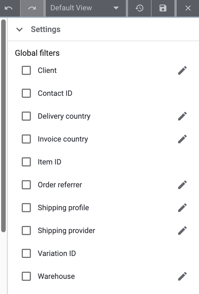
First, activate () the filters that should be available for use in the element later.
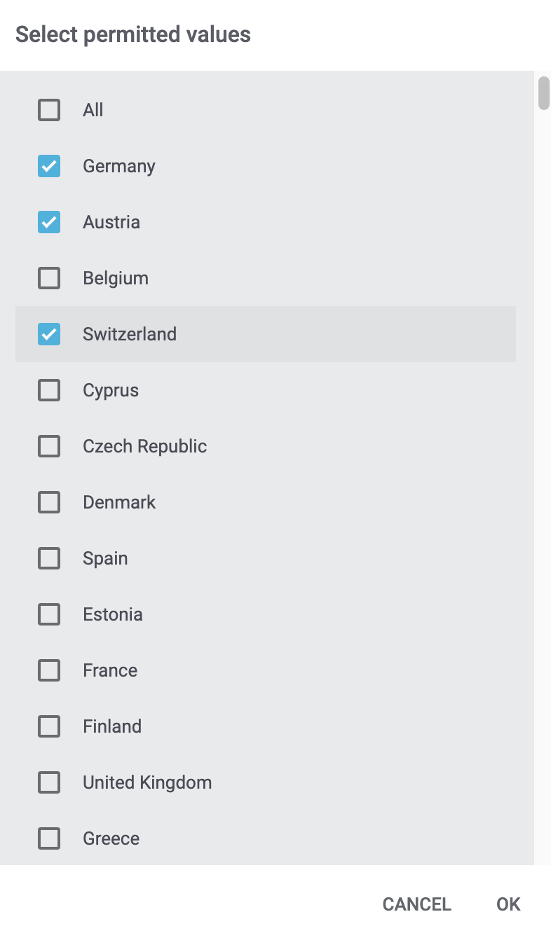
For most filters, you can click on Edit () to determine which search criteria should be displayed for each filter. This way, you avoid having to scroll through long drop-down lists and the filter can be used quickly later. Activate () the search criteria that you need. Figure 2 shows a sample selection of criteria for the Invoice country filter.
5.2.3. Applying filters
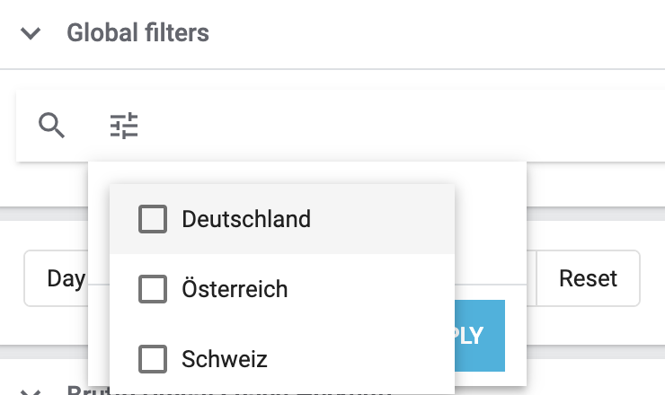
After saving the settings, filters for which the settings described above are carried out are displayed on the dashboard as shown in Figure 3.
Now, you can apply this filter every time you access the dashboard.
Applying filters:
-
Click on Filter (tune).
-
Click on () at the right of the desired filter.
→ The search criteria that are possible for this filter are displayed. -
Activate () one or more criteria.
Tip: Click on the operator to the left of the name of the criterion to further adjust the behaviour of the filter. -
Click on Apply.
→ The filter is applied and the dashboard view is reloaded. Afterwards, the filtered data is displayed.
Tip: The filter criteria that are currently applied are displayed at the top as so-called “chips”. Click on clear to delete the filter.
5.2.4. Using default filters
Do you prefer to automatically filter the data of the dashboard view according to specific filter criteria when opening the view instead of applying the filter manually each time? Proceed as described below to carry out the necessary settings.
Using default filters:
-
Go to PlentyONE logo (Start) » Dashboard.
-
Click on Edit view ().
-
Go to the Global filter section.
-
Click on Filter (tune).
-
Select the filter and criteria that should be used to filter the data of the dashboard view every time the view is opened. To do so, proceed as described above.
-
Save () the settings.
→ The default filter is applied.
|
Removing default filters
Do you want to remove a previously set up default filter? To do so, open the editing mode of the dashboard and click on clear. at the right side of the filter. Then, click on to update the filter. Finally, save your settings. This way, the default filter will be removed. Proceed as described above to add new filters. |
5.2.5. Adjusting the global time interval
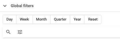
Global filters enable you to temporarily display the data of all charts, tables and tiles for a specific time interval. The options Month, Day, Week, Quarter and Year are available. Would you like to filter all data so that you could see the values for the current week? Simply click on Week. If you click on Reset, the data will once again be displayed according to the time interval that you have selected in the settings of the respective chart, table or tile. Figure 4 shows what the options for adjusting the time interval look like.
5.3. Exporting data to Google Sheets
Previous chapters already explained how you can export data from individual tiles, tables, combined tables and graphs to Google Sheets.
In addition, you can export data from multiple elements, or, if needed, of all elements included in the dashboard view to a Google sheet. To do so, proceed as described below.
|
Pay attention to the requirements
Make sure that the following requirements are met before you use the function.
|
Exporting data to Google Sheets:
-
Go to PlentyONE logo (Start) » Dashboard.
-
Open the dashboard view whose data you want to export.
-
Move the cursor over a tile, table, combined table or graph of your choice.
-
Click on Actions (more_vert).
→ The context menu opens. -
Select the option Export to Google Sheets.
→ A new window opens. -
Select () the elements whose data you want to export. Activate the option Whole dashboard to export all data included in the dashboard view.
-
Click on Next.
-
Enter the URL of the Google sheet that you have created beforehand.
-
In addition, enter a target cell to determine the starting point for the data export to the sheet.
Example: By enteringA1, the export will start from the top left corner of the Google sheet. -
Click on Sign in with Google.
→ Select your Google account and grant PlentyONE access to your Google sheet. Afterwards, the data are exported to the sheet.
5.4. Displaying notifications
Notifications alert you to important information on your PlentyONE system. You can access these notifications by clicking on the bell symbol at the top margin of the PlentyONE back end. By clicking on the bell symbol, all current notifications are displayed. In addition, a section for notifications is displayed by default when opening a dashboard view for the first time or when creating a new dashboard view. Proceed as described below in case you have deleted this section and want to display it again.
Displaying notifications on the dashboard:
-
Go to PlentyONE logo (Start) » Dashboard.
-
Click on Edit view ().
-
Drag-and-drop the Notifications element from the settings menu on the dashboard.
-
Save () the settings.
5.5. Tracking tasks
You can use the task widget to keep track of your company’s work processes. Simply assign tasks to individual employees and then track the progress of each task. This way you can always keep an eye on current projects.
Adding the task widget:
-
Go to PlentyONE logo (Start) » Dashboard.
-
Click on Edit view ().
-
Drag-and-drop the My tasks element from the settings menu on the dashboard.
-
Save () the settings.
For further information and a practical example for managing tasks, refer to the Customizing your system manual page.