Designing the template structure in the DocumentBuilder editor
|
Guided tours available
The guided tours Documentbuilder-Basic settings and DocumentBuilder-Editor are available in the Setup » Documents » DocumentBuilder menu. The tours show you the most important functions step by step. |
Use the DocumentBuilder editor to design your template structure and to add content. You do this using the Editor’s various widgets, which you drag and drop into the template and then configure to suit your needs.
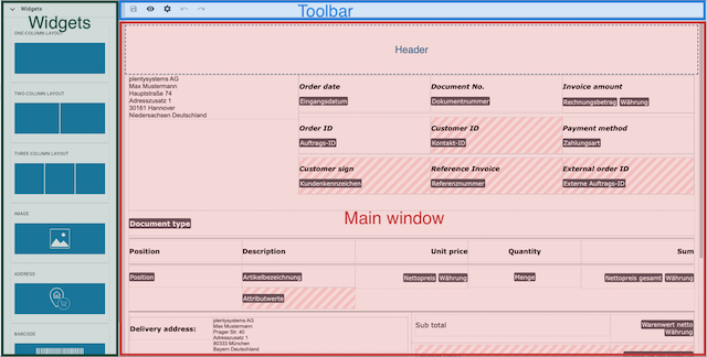
Open a template and click on edit to open the Editor screen:
-
Widgets: This is where you select the widgets that you want to drag into the template. The first three widgets are structure widgets. Use these to create your template structure. Below them are the content widgets. Use these to create your template content.
Note: Among the content widgets is the order-items widget, a combination of structure widget and content widget that serves to dynamically list order items. -
Toolbar: Click onsave to save changes, onvisibility to preview the template, and onsettings, to open the output settings for the template.
-
Main window: This is where you edit the template that you have selected. The image above shows a template for which the content structure has already been created. Click on the explanation below for a brief description of how the structure and content were created in the DocumentBuilder editor.
-
The order items table was created using the order-items widget.
-
The table structures outside the order item table were created using structure widgets.
-
The names of the fields were created using text widgets.
-
The variables (black background) were added using text widgets.
-
The addresses were added using address widgets.
-
The fields with a grey and white checked background indicate that the respective field is empty and can accommodate a widget.
-
The pink and white lines indicate that a restriction has been set for the text widget located here.
1. Inserting widgets into a template
To insert a widget into a template, proceed as follows:
-
Go to Setup » Documents » DocumentBuilder.
-
Click on Search (search) to list the existing templates.
-
Click on the template you want to edit.
→ The template opens. -
Click Open Editor (edit).
→ The editor opens and the widgets are loaded. -
Click on the widget you want to insert and drag and drop it into a checked field.
-
Click on settings to carry out the settings. Refer to the sub-chapter Available Widgets for detailed information on the individual widgets.
-
Save (save) the settings.
2. Available widgets
DocumentBuilder contains structure widgets for designing the template structure and content widgets for creating the template content. The following sub-chapters provide detailed information on how to use the various widgets.
2.1. Structure widgets
Using the structure widgets listed below to structure the information fields in a DocumentBuilder template. Click on one of the links below or scroll through
Table 1 for detailed information on the individual structure widgets.
*Note:* Create more than three columns by inserting further widgets into an existing widget.
| Widget | Explanation |
|---|---|
[#intable-widget-one-column-layout],* One-column layout* |
Creates a one-column structure in which to display content. Settings: Restrictions: Inserting further widgets: Click on Delete widget (delete) to remove the widget. Click on Close settings (close) to close the settings. |
Two-column layout |
Creates a two-column structure in which to display content. Settings:
You can also define the width of the Border, the Padding and Margin in mm. Select (done) the respective setting and choose the desired size in mm from the drop-down list. Restrictions: Inserting further widgets: Click on Delete widget (delete) to remove the widget. Click on Close settings (close) to close the settings. |
Three-column layout |
Creates a three-column structure in which to display content. Settings: Restrictions: Inserting further widgets: Click on Delete widget (delete) to remove the widget. Click on Close settings (close) to close the settings. |
2.1.1. Inserting further widgets into an existing structure widget
After you add a structure widget to a DocumentBuilder template, you have the following two options:
-
Insert content widgets into the structure widget (only one content widget per column possible).
-
Insert further structure widgets to create the additional information fields you need (multiple further structure widgets per column possible).

To create the four-column structure in the image above, proceed as follows:
-
Drag one two-column widget into the template.
-
Open the widget settings (settings).
→ The widget settings open in a column to the right. -
Use the Layout dropdown to change the ratio of the columns to each other from 50:50 (default) to 30:70.
-
Close the widget settings.
*_Note:You must close the widget settings to continue editing the template. -
One by one, drag four three-column widgets into the right-hand column of the original two-column widget.
*_Note:When you drag in a further widget, blue lines light up as you move across the original widget. These indicate the available drop zones for the further widget. Use them to correctly place the further widgets.
2.1.2. Identifying the correct settings icons in structures created using multiple widgets
To adjust the settings in a multi-widget structure, you need to identify the settings icons (settings) belonging to the individual widgets. For this, note the following rules:
-
The settings icon (settings) for the original widget appears in the top right corner of the widget structure.
-
The settings icon (settings) for each further widget inserted into the original widget appears in the middle of the respective further widget.
-
If you add more widgets to a further one-column widget or to the central column of a further three-column widget, the following applies:
The settings icons (settings) will all appear in the middle, as in rule 2 above, but in sequential order from left to right based on the order in which the further widgets were inserted.
2.2. Content widgets
Use content widgets listed below to create the content for a template. Click on one of the links below or scroll through Table 2 for detailed information on the individual content widgets.
Widget |
Explanation |
||||||||||||||||||||
Image |
Use this widget to …
Settings:
Use the other settings to set the height and width of the image in px, and to set the*Rotation* and the Alignment for the image. Restrictions: Click on Delete widget (delete) to remove the widget. Click on Close settings (close) to close the settings. |
||||||||||||||||||||
Address |
Use this widget to display address fields. Settings: Restrictions: Click on Delete widget (delete) to remove the widget. Click on Close settings (close) to close the settings. |
||||||||||||||||||||
Barcode |
Use this widget to display barcodes. Settings:
The following two checkboxes appear only if you select a Giro code or Swiss QR code from the Barcode / QR code dropdown-list:
Detailed explanation of the checkboxes Overwrite bank master data / Overwrite company master data:
To generate a Giro code/Swiss QR code in a document, the corresponding DocumentBuilder template pulls the required bank and company data directly from the data entered in the Setup » Settings menu and transfers this data into the Giro-Code/Swiss QR code. In PlentyONE, only one set of master bank / company data can be configured per system. To generate Giro code/Swiss QR codes for a client (webshop) that has different bank / company data than that stored in the system, the template-transferred data needs to be automatically overwritten. This is what the checkboxes Overwrite bank master data and Overwrite company master data are for. To overwrite the master bank / company data for a Giro code/Swiss QR code, proceed as follows:
Restrictions: Click on Delete widget (delete) to remove the widget. Click on Close settings (close) to close the settings. |
||||||||||||||||||||
Text |
Use this widget to*enter text* and add variables. You can also format the text you entered. To open the format settings for the text, simply select the text that you want to format. In the window that opens you can adjust the format settings for the selected text. Inserting variables: Click on edit to open the list with the variables on the left side of the screen. Use the search function to find the variables or find the appropriate variables by expanding the individual areas (chevron_right). Click on the variable you want to insert. Enter additional text in the widget, if needed. The manual page Using variables provides a list of the available variables, divided into categories. Setting restrictions (in the old text widget):
Click on settings to open the settings. If required, you can set a restriction for the text widget here. If you set a restriction, the content of the text widget will only appear in the document if the value selected in the restriction also exists in the corresponding order. Restrictions available for a text widget
Click on Delete widget (delete) to remove the widget. Click on Close settings (close) to close the settings. |
||||||||||||||||||||
Text (new) |
This widget behaves just like the old text widget described above in all aspects – with one important exception: The restrictions. For all functions except the restrictions, please refer to the explanations above. What is a restriction? Differences between the Text and Text (new) widgets: Text: Text (new): |
||||||||||||||||||||
Order items |
Use this widget to define how order items should be displayed. Settings: Begin by selecting the Order item types from the drop-down list. If necessary, you can then adjust the Outer spacing in mm, the Frame (header), the Inner spacing in mm (header), the Frame (cell), the Inner spacing in mm (cell) and the Width of the column in mm by ticking the setting (done). Click on unfold_more to change the order of the columns. Click on Add new entry ( add) to add more columns. Click on Remove entry (delete) to delete columns from the overview. Click on Delete widget (delete) to remove the widget. Click on Close settings (close) to close the settings. |
||||||||||||||||||||
Shipping |
Use this widget to define how shipping information should be displayed. The widget is repeated for every order item in the order. If your order has several packages, than the widget will store the respective information for every package. First place a structure widget in the shipping widget (for example a two-column layout, to determine how the information is structured. Here you can then place a text widget to add information about package weight, package number and tracking URL with the shipping packages variables under Order. You can also place the barcode widget to the shipping widget. Thus, specify the barcode for every order item. .Example of a completed shipping widget image::shipping-widget-example-en.png[width=650, height=200] If necessary, you can then adjust the Outer spacing in mm, the Frame (header), the Inner spacing in mm (header), the Frame (cell), the Inner spacing in mm (cell) and the Width of the column in mm by ticking the setting (done). This widget is only available for the following document types: invoice, delivery note, repair slip and warranty. Click on Delete widget (delete) to remove the widget. Click on Close settings (close) to close the settings. |
||||||||||||||||||||
Code |
Use this widget to apply individual styles to a template (e.g. to show the quantities of order items in bold) and to implement more complex approaches to processing and displaying data. Note: If you use the code widget in a template, the corresponding documents may take a little longer to generate. Click on to open the list of variables on the left side of the screen. Use the search function to find individual variables or click on a variable category to display the corresponding lists (chevron_right). Click on the variable you want to insert. The variable is inserted at the point where you place the cursor. Click here for code examples Click on () to close the widget window. Click on settings to open the settings. Click on Delete widget (delete) to remove the widget. Click on Close settings (close) to close the settings. |
||||||||||||||||||||
Page break |
Use this widget to set page breaks in your template. Simply drag the widget to where you want a page break to occur. There are no further settings for this widget. Important: To see set page breaks in the preview, select the format PDF in the Show preview window. Page breaks are not visible in HTML format. Click on Delete widget (delete) to remove the widget. |
|
Changing the Document type setting in existing templates
Note that the range of available widgets can differ depending on the document type. In some cases, if you subsequently change the Document type setting in an existing template, not all of the originally selected widgets will be available for the newly set document type. If this occurs, an error message will appear. |
3. Widget restrictions
Use a widget restriction to specify that the content of the respective widget will only appear in a document under certain conditions – for example, only if the associated order has a specific referrer or contains certain items.
3.1. Using widget restrictions
-
To set up a widget restriction, proceed as follows: Refer to the section Inserting widgets into a template for more information.
-
Open the widget settings (settings).
The widget settings open in a column to the right. -
Click on Restrictions at the bottom of the column.
→ The window widget-restriction opens.-
Option 1: To set the first condition, select a restriction type from the dropdown list.
→ Further settings for the restriction type will appear. -
Option 2 (not available for all document types): Select one of the preset restrictions via Add preset restriction (rule_folder) at the top right of the window. These are frequently used restrictions and restriction combinations that are pre-configured.
Note: If you want to adjust the preset restriction, continue with step 4. Otherwise, jump to step 5.
-
-
Carry out the additional settings. For this, refer to the sections Using conditions in a widget restriction and Using operators in a widget restriction.
-
Add additional conditions and sub-conditions as needed.
-
Confirm the restrictions.
-
Save (save) the settings.
Note: The symbol settings with an exclamation mark inside a widget indicate that a restriction has been set for the widget.

3.2. Using conditions in a widget restriction
When you open the widget restrictions window as described in the section Using widget restrictions and select the restriction type, the following settings will appear in the window:

| Availability | Setting | Explanation |
|---|---|---|
1\. |
AND & OR |
Use this setting to add conditions and define the relationships between them. For more details on the functions, refer to the section Using conditions and preset restrictions. |
2 |
Restriction type |
Select a Restriction type from the drop-down list. to define the field in the order dataset that will be checked for the restriction. |
3 |
Operator |
Use an operator to define how the value in the order data is compared with the value in the input field. You can find more details about the available operators in the section Using Operators. |
4 |
Entry field |
Here, you enter or select the values to filter by. |
3.2.1. AND & OR, using conditions and preset restrictions
With the settings listed below, you can add restriction conditions (playlist_add ) or sub-conditions (library_add ) to a widget restriction and define the relationships between them. You can also playlist_addadd preset restrictionsplaylist_add (library_add) as needed.
| Setting | Explanation |
|---|---|
Adding conditions and sub-conditions: |
|
Condition(playlist_add) |
A condition defines the criteria an order must meet for the widget’s content to appear in the document. The first condition is pre-configured and ready to be set. Use playlist_add to add additional conditions. |
Nested level (library_add) |
Use the nested levels to create sub-conditions within a condition. This allows you to build complex hierarchies within conditions. |
Defining the relationships between the conditions: |
|
AND |
Select AND if an order must meet all the linked conditions for the widget’s content to appear in the document. |
OR |
Select OR if an order must meet one the linked conditions for the widgets content to appear in the document. |
Use a preset restriction: |
|
Add preset restriction (rule_folder) |
Choose one of the following options to add a preset restriction or combination of restrictions directly:
Notes:
* The preset options are customisable.
|

When this restriction is set in a widget, the system checks whether the associated order came directly through an own webshop and contains a specific item. If so, the document is generated with the widget content. If this is the case, the document will be generated including the widget content. Otherwise, it will be generated without the widget content.
3.2.2. Applying an operator in a condition
With the operators listed below, you define how the value in the order to be checked is compared with the value in the input field for a widget restriction.
*Note:*For many of the restriction types, only one or only a selection of the operators listed below are available.
| Operator | Explanation |
|---|---|
= |
Is equal to |
IN |
Is in |
NIN |
Is not in. |
>= |
Is greater than or equal |
⇐ |
Is less than or equal to |
> |
Is greater than |
< |
Is less than |
[] |
Is between |
∃ |
Exists |
∄ |
Does not exist |