The shop editor
The new shop from PlentyONE has its own what-you-see-is-what-you-get editor, which you can use to edit your shop pages without any programming knowledge. This means that content is displayed exactly as it will appear in your shop while you are editing it.
|
Requirements for the shop editor
To use the shop editor and make your shop available online, you need a valid SSL certificate. |
|
Shop editor currently only available in English
The UI elements of the editor are only available in English. |
1. Opening the shop editor
Open the shop editor to configure your shop settings.
Important: You can only open the editor and edit the shop if the preview mode is activated. To activate the preview mode, click play_circle Activate preview mode in the shop line.
Opening the shop editor:
-
Go to Shop » Shop Management.
-
Click design_services Open editor in the line of the shop you want to edit.
→ The editor will open in a new tab.
→ The shop settings are located in the toolbar on the left-hand side. Click on an icon to open the respective settings.
2. Structure
The editor consists of three sections:
-
On the left-hand side (orange), you’ll find the global settings. These include page management, colour settings, options for fonts and spacing between individual page elements, SEO settings, and much more.
-
The preview section for the page is located in the centre. Additional page content - so-called blocks - can be added here.
-
On the right-hand side (blue), you’ll find the block-specific settings in which you can change texts or select images.
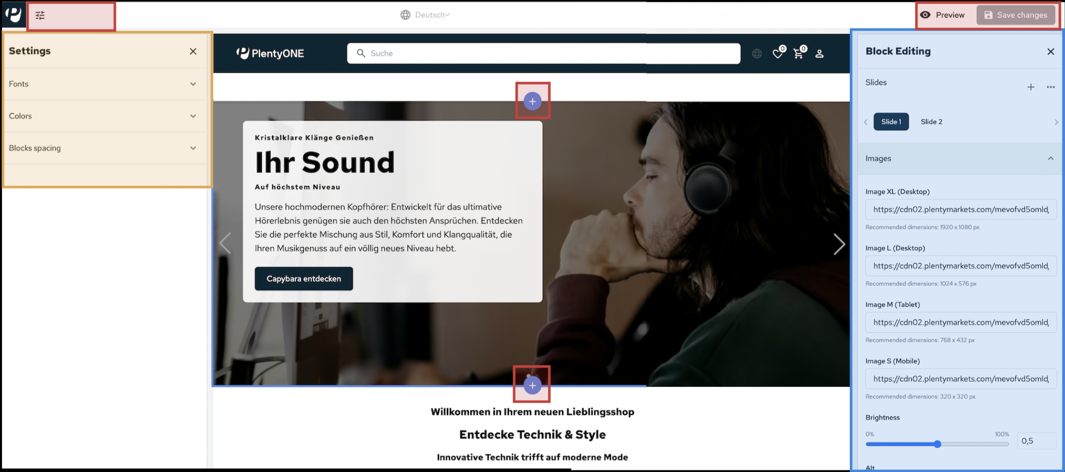
Each block has a UI element that is displayed when hovering over the respective block with the cursor.
This UI element can be used to access the block settings (edit), move the block on the page or delete the block.
A plus button is displayed above and below each block, with which additional blocks can be added at the selected position.
3. Shop settings
You can configure all settings for your PlentyONE shop directly in the shop editor. Changes are immediately visible in preview mode.
|
Language in the shop editor
The user interface of the shop editor is currently only available in English. |
3.1. The shop editor’s toolbar
Click on the icons in the toolbar (on the left) to open the shop settings.
| Icon | Settings section |
|---|---|
article |
Pages: Page and category management |
language |
Localization: Language and translations |
brush |
Branding & Design: Design, colours & logos |
category |
Category: Category management and sorting |
shopping_cart |
Checkout: Checkout process & VAT verification |
code |
Custom Code: Upload your own CSS/JS snippets |
settings |
General Settings: Contact, performance & security |
sell |
Item Settings: Item settings |
search_insights |
SEO: Search engine optimisation |
3.2. Carrying out settings in the editor
Carrying out shop settings:
-
Go to Shop » Shop Management.
-
Click design_services Open editor in the line of the shop you want to edit.
Important: You can only open the editor and edit the shop if the shop is active and has the status Running. To activate the shop, click play_circle Activate preview mode in the shop line.
→ The editor will open in a new tab.
→ The shop settings are located in the toolbar on the left-hand side. Click on an icon to open the respective settings. -
Save (save) your settings after making changes.
3.3. Managing pages

In the Pages section, you manage your online shop pages. You can add new pages, change the order of pages in the navigation, and configure page-specific settings.
Adding a new page:
-
Open the shop editor.
-
Click add Add Page.
→ The Add Page window opens. -
Page Name: Enter a unique name for the page.
-
Page Type: Select the page type.
-
Content (pages with static content, for example legal texts or blogs)
-
Product Category (item page)
-
-
Parent Page: Determines whether the page will be a subpage or a new, independent page.
-
Click (add) Add Page to add the new page.
| A page created in the editor automatically creates a corresponding category in the backend. |
3.3.1. Editing a page
To adjust the settings of an existing page, navigate to the categories in the lower section of the Pages menu:
-
Content Pages: Includes all static pages (e.g. legal texts).
-
Product Categories: Contains the product categories of your shop.
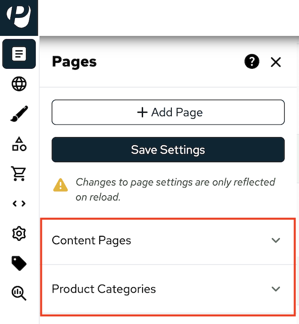
Opening the page settings:
-
Expand the desired section.
-
Point the cursor over the page you want to edit.
-
Click the gear wheel icon (settings).
-
Carry out the settings in the General Settings or SEO Settings sections.
For more information about the settings, see the chapters General settings and Search engine optimisation. -
Click Save settings to apply the changes.
3.3.1.1. General settings
These settings define the identity and visibility of the page.
| Setting | Explanation |
|---|---|
Basics |
|
Page ID |
A unique identification number for the category. The ID cannot be changed. |
Page Type |
The page type determines the functionality of the page.
|
Page Name |
The title of the page as it appears in the shop. This title can be displayed in the navigation depending on the settings. The title can be changed at any time. |
Parent Page |
Select a Parent Page if you want to create a new page as a child page. |
URL Slug |
A URL slug is the last part of a URL that serves to make the page uniquely identifiable. The URL slug can be changed at any time. |
Position |
The position number determines where a page is displayed in the navigation. Lower position numbers are displayed higher up in the navigation. |
Activate page for store |
As long as this option is enabled, the page will be accessible to visitors to your shop and website crawlers. You can deactivate the page to customise it to your liking. Only activate pages once you are satisfied with their layout and content. |
Display in header navigation |
Activate to make the page accessible via the navigation in the header. |
Login Necessary |
Activate to make the page accessible only to logged-in customers. |
3.3.1.2. Search engine optimisation (SEO)
Here you control how a single page is perceived by Google, etc.
| Setting | Explanation |
|---|---|
SEO |
|
Meta Data |
|
Title |
Enter a meta title. The meta title defines the title of your page for search engines (=the link to your page in the search results). |
Meta description |
Enter a meta description. The meta description is evaluated by search engines as a brief description of your page. The meta description should have up to 160 characters. |
Meta keywords |
Enter relevant search terms that give search engines a better overview of the content on your pages. Enter keywords in lower case and separated by commas. |
Robot settings |
|
Robots |
This setting affects how search engines treat your shop page. You can specify the behaviour for each page separately.
|
Further settings |
|
Canonical URL |
Enter the URL to use as the canonical URL for item pages. A canonical URL is the version of a web page that search engines should consider to be the original. |
Include page in Sitemap.xml |
Enable if the page should be included in the sitemap.xml. A sitemap.xml is a structured file in XML format that lists all relevant subpages, images and videos of a website. A sitemap.xml can help search engines efficiently capture the structure of a website. |
3.4. Managing languages and translations

In the Localization menu, you carry out settings for languages and translations.
-
In the Shop Languages section, you set the default language for your shop and add additional languages that users can select in your shop.
-
In the Edit translations section, you can maintain translations for various elements of the shop.
-
Once you have activated a language (check_box), click edit Edit translations to translate the various elements of the user interface. A new column is added for each language, where you can enter your translations.
-
Note: Only the static texts specified by the shop can be translated into the selected languages. These are all texts that cannot be edited using the editor. Texts that you add yourself in the editor, as well as item and category data, cannot be translated here.
-
|
Shop must be deployed
The settings in the Localization menu will only be applied after the shop has been redeployed. |
3.5. Branding & Design

In the Branding & Design menu, you can define the visual identity of your shop, i.e. save your logo and favicon and carry out settings for fonts, colours and headers.
3.5.1. Uploading logo and favicon
Upload the main images for your shop in the Branding » Images section. The files are managed via your file manager.
-
Favicon: The Favicion is an image file in .ico format. It serves as a visual identifier for your shop, displayed in browsers next to the page title in tabs or in bookmark lists.
Recommended dimensions: 32 x 32 px or 48 x 48 px -
Logo: The logo is an image file that appears in the left corner of your shop header on all pages. The file must be in .svg, .webp or .avif format.
Recommended dimensions: Format .svg = 150 x 40 px; formats .webp or .avif = 180 x 80 px
Uploading an image file:
-
Open the shop editor.
-
Go to Branding » Images.
-
In the Favicon or Logo section, click Select to open the file selection for your File Manager.
Note: You can manage the file manager in the PlentyONE backend in the Shop » File Manager menu. -
Click upload in the right-hand section of the file selection to open the file upload.
-
From the Root Folder drop-down list, select a folder in your file manager where you want to upload the image file.
-
Drag a file into the section or click Click to select file to select a file.
-
Click Add image to upload the file.
→ The file is uploaded.
3.5.2. Editing the shop name
In the Branding » Texts section, you can customise the name of your shop. The shop name is the name that appears in search engine results.
Click in the input field to customise the name of your shop.
3.5.3. Defining the shop design
In the Design section, you can set the colour scheme and typography for your shop.
|
Visibility of the changes
Fonts will only be visible after the shop has been deployed. You can see colour adjustments immediately in the editor preview mode. |
| Setting | Explanation |
|---|---|
Design |
|
Fonts |
|
Global fonts |
Select the font that will be used globally for all shop pages. Click on the selection field to expand the drop-down list for fonts and select a font. |
Colours |
|
Primary colour and secondary colour |
Define the colour scheme of your shop. The primary colour and secondary colour form the basis of your shop’s colour scheme. Ten shades are generated from both colours, which are used in different places in the shop to dynamically colour your shop. There are two ways to choose the colour: |
Header |
In the Header section, you can specify the colour scheme for the header. This allows you to design your header separately from the other pages of your shop. You set the colours for the header globally, so the header looks the same on every page of your shop. There are two ways to choose the colour:
|
Spacing |
|
Horizontal spacing & Vertical spacing |
Define the horizontal and vertical spacing of the blocks. This means that you determine how far apart the different components of the page should be arranged.
You can select from four spacing options:
|
3.6. Category

In the Category menu, you can specify how items are arranged in your categories.
Table 5 contains an overview of the available settings.
| Setting | Explanation |
|---|---|
Category Sorting |
|
Enable item sorting by |
Select from the drop-down list which criteria (price, name, etc.) customers can use for sorting. |
Default Sorting |
With this setting, you can specify the value by which items should be sorted on the category page by default. If you select the Recommended option, you can adjust this value to suit your needs using the Recommended Sorting setting. |
Recommended Sorting |
|
First sorting option |
With these options, you determine how the “Recommended” sorting value, which customers can select in the shop, is calculated.
The first sorting option has the highest priority in sorting, the second value has the second highest priority, and so on. Note: These settings will only be applied after the changes have been saved and the page has been reloaded. |
Variation Position Based On Sales |
|
Calculate the variation position based on monthly sales |
With this setting, you can specify whether variations should be sorted by number of sales. Activate this option to sort variations based on last month’s sales figures.
Once per night, the variations that were purchased most frequently in the last month are calculated. |
3.7. Checkout

In the Checkout menu, you can configure settings for the checkout process in the shop.
Table 6 contains an overview of the available settings.
| Setting | Explanation |
|---|---|
Customer Input Settings |
|
Your Reference Input Field |
Activate to add an input field for “Your reference” in the checkout process, where customers can enter a separate customer name or contract number as a reference, for example. |
Customer Wish Input Field |
Activate to add an input field for additional customer requests that can be added to the order during the checkout process. |
Vat Number Validation |
|
Validate VAT number |
Activate if the customer’s VAT identification number is to be checked during the checkout process. The VAT identification number is always checked when an order is completed or when the customer’s address has been changed. |
3.8. Custom Code

In the Custom Code section, you can customise your shop with your own code snippets:
-
* Custom CSS*: Individual styling and layout adjustments.
-
Custom JavaScript: Dynamic elements and functional enhancements.
-
Custom meta tags: Additional descriptions for SEO or verification.
-
External Scripts & Styles: Integration of external scripts, stylesheets and libraries.
3.8.1. Managing snippets
-
Display snippets: Expand the Saved Snippets section to display all previously saved snippets.
-
Edit snippets: Click edit to edit a snippet.
-
Enable snippets: Activate the toggle button next to the snippet (toggle_on) to activate the code.
-
Add snippets: Click add Add snippet to define additional code snippets.
|
Debugging
In safe mode, all custom code snippets for the shop are globally deactivated. This can be useful, for example, if you want to debug your shop. |
3.9. General settings

In the General Settings menu, you can manage settings related to contact, security, and performance. Table 7 contains an overview of the available settings.
| Setting | Explanation |
|---|---|
Contact Form |
|
Contact Form Email |
Enter your email address for the contact form in the Contact Form Email input field. When customers fill out the contact form in your shop, the form will be sent to this email address. |
Customer Management Assign standard customer classes for B2B and B2C/guests. Note: Changes to the customer class will only be applied after you have saved the changes and reloaded the editor. |
|
Default B2B Customer Class |
Select the customer class from the drop-down list Default B2B customer class that should be assigned to B2B customers by default. |
Default B2C And Guest Customer Class |
Select the customer class from the drop-down list Default B2C and guest customer class that should be assigned to B2C customers by default. This customer class is also assigned to customers who place orders as guests in your shop. |
Performance |
|
Image Optimization Automatically convert item images into modern formats. This reduces the file size and speeds up loading. This may increase the cost of cloud storage, but it reduces traffic costs. |
|
Convert item images to AVIF |
Activate to convert images in your shop to the .avif file format. |
Convert item images to WebP |
Activate to convert images in your shop to the .webp file format. |
Security |
|
Session and Url Lifetime |
|
Validity of the session cookie |
This setting determines how long the session cookie should remain valid. This means you determine the session duration of your shop. A session cookie is a small text file that is stored on your computer or smartphone while you are browsing. The session cookie ensures, for example, that items remain in the shopping basket while customers browse your shop and that your customers remain logged in while surfing your shop. The following options are available for setting the lifetime of the session cookie:
|
Shipping Information Page |
|
Category for shipping information page |
Select the category whose data should be used as a template for the shipping information. By default, this page is linked wherever shipping costs are mentioned. Visitors who click on the link will be redirected to the category page containing your shipping cost details. |
3.10. Item settings

In the Item Settings menu, you can configure settings for availability notifications, item bundles, and the display and sorting of your items in your shop.
Table 8 contains an overview of the available settings.
| Setting | Explanation |
|---|---|
Back In Stock Notifications |
|
Enable notify me |
Activate if you want a subscribe button to appear on product pages for sold-out items. When customers click Subscribe, they will be notified by email as soon as the item is available again. To send the email, you need to set up the automatic email dispatch. A template for the availability notification is provided by default. You can customise the template in the EmailBuilder. |
Item Bundles |
|
Bundle presentation and behaviour in the basket |
Defines how item bundles should be displayed in your shop and in the shopping cart. The following options are available:
|
Item Internal Sorting |
|
Adopt title sorting from item sorting |
Use this sorting option if the item sorting selected by customers in the shop should also apply to the sorting of variations on an item page. In this case, the selected value is used as the first sorting value for the item page. |
Sorting Option 1 and Sorting Option 2 |
The settings for Sorting Option 1 and Sorting Option 2 only apply if no clear order can be derived from the item sorting selected in the shop or if the Adopt title sorting from item sorting setting is not used. |
Manufacturer Information |
Defines which manufacturer information should be displayed in the item view. |
3.11. SEO settings

In the SEO Settings menu, you carry out settings for search engine optimisation. This includes settings for robots, i.e. crawlers that track and index pages for search engines, rich snippets and schema.org-supported structured data.
Table 3 contains an overview of the available settings.
| Setting | Explanation |
|---|---|
URL Handling Define the URL structure for items and variations. |
|
Custom canonical URL for item pages |
|
Set up custom Canonical URL for single item views |
This setting allows you to manually specify a canonical URL for variations that may be recognised as duplicates by crawlers. |
Item URL Scheme Determine whether variations of an item get their own URL or share the same URL. |
|
Unique Variation URLs |
Activate if each variation should get its own URL. |
Single Product URL |
Activate if all variations of an item should be accessible via the same URL. |
Meta data defaults Set default values for meta data, such as title and description. Note: The settings in the Meta data defaults section are global settings. These settings apply to all pages that do not have page-specific settings. |
|
Default title |
Enter text that should be displayed as the title in search engine results. |
Default meta description |
Enter a short description of the shop that will be displayed in search engine results. The text should be informative and appealing. |
Default meta keywords |
Enter search terms relevant to your shop, separated by commas. Meta keywords can help your shop to be found using specific search terms. |
Robots |
|
All Pages The settings in the All Pages section define the default behaviour of the search engine for all pages in your shop. By default, all pages should be indexed (select the All option) to ensure that your items and content can be found. |
|
Robots |
This setting determines how search engines should treat automatically generated pages.
|
Static Pages Determine how search engines treat the integrated pages of your shop. By default, those pages should be indexed (select the All option) to ensure that they can be found. Only restrict indexing if there is a specific reason for doing so, e.g. temporary content, duplicate pages or private pages.
Available options:
|
|
Item Pages |
|
Robots for item pages |
Set default values for the robots meta value of your article pages.
|
Exclude URLs with parameters (depends on if it excludes or includes when active) |
Activate if item pages with URL parameters (such as referrer or language) should be excluded from search indexing. |
Paginated Pages |
|
At which page should robots stop indexing your category pages? Default = 0 |
Specify the number of paginated pages that search engines should index. The value 0 means that only the first page is indexed, while subsequent pages are not indexed. Only increase this number if additional paginated pages are to be displayed in the search results. Note that this may result in duplicate content. |
Improve product listings in search engines Specify how item details are displayed in search results. This helps search engines to present your articles in a clearer and more appealing way. |
|
Availability |
Availability 1-10 = Assign the availabilities defined in the Setup » Item » Availability menu to the availabilities defined by Schema.org from the drop-down list. This enables search engines to better evaluate availability information. |
Item Condition |
Assign the item conditions defined in the menu Item » Items » [Open item] » Section: Settings » Drop-down list: Condition to the conditions defined by Schema.org from the drop-down list. This enables search engines to better evaluate the condition of the item.
|
Rich Snippet Mapping |
Select the data sources in PlentyONE from which the rich snippets for item pages should be taken for the brand, manufacturer, SKU, and various barcodes. Rich snippets are structured data that provide extended data for search engines. Some of the selectable options display additional input fields where you can enter the ID of a text property, for example, to make rich snippets more versatile.
Note: If you select Do not display, the data (e.g. the manufacturer or brand) will not be passed on as a rich snippet. |
3.11.1. Representation on social media
In the SEO Settings » Social Media section, you can specify how your shop will be presented when it is shared online.
The following settings are available:
-
Image for OpenGraph = Enter the URL of the image that should be displayed as a preview image when the shop is shared on social media.
Recommended dimensions: 1200 × 630 px -
Title for OpenGraph = Enter a title for your page that will be displayed when the shop is shared on social media.
Recommended length: 40–60 characters; maximum 80 characters
3.11.2. Setting up Google Analytics
|
Information obligation concerning data protection
When using Google Analytics, you are obliged to provide information about how the data is used in your privacy policy. Note that when using services which transfer personal data to third countries (e.g.: USA), the requirements for authorised data transfer in accordance with Art. 44 ff GDPR must be met. This is the case when Google Analytics is used. |
In the SEO » Tracking & Analytics » Google Analytics menu, you can integrate the Google Analytics analysis service into your shop in order to collect and evaluate data on user behaviour on your pages.
-
All automatically collected events, such as purchases and shopping carts, user interactions and checkout process, as well as some link: recommended events.
-
Affiliate data is evaluated, i.e. when customers enter your shop via affiliate links or partner recommendations, this data is recorded.
Table 10 contains an overview of the available settings.
| Setting | Explanation |
|---|---|
Cookie Group |
Select the cookie group in which the Google Analytics cookie should be included (Necessary, External Media, Functional or Marketing (recommended)). By default, the Google Analytics cookie is added to the Marketing group. |
Enable Google Analytics |
Activate if you want to use Google Analytics. |
Google Analytics Tracking ID |
Enter the Google Analytics tracking ID. This ID has the format UA-12345678-9. Without this tracking ID, the behaviour of visitors to your shop cannot be evaluated. |
Register Cookie as opt-out |
Activate to use the Google Analytics cookie as an opt-out option. This means that the cookie is initially active and users must proactively reject this cookie if they do not want their behaviour to be tracked and evaluated. This option can only be activated if the Google Analytics cookie is not assigned to the Necessary cookie group. |
Send Gross Prices to Google Analytics |
Activate to transmit gross prices to Google Analytics. Net prices are transmitted by default. |
|
Shop must be deployed
The settings in the Google Analytics menu will only be applied after the shop has been redeployed. |
4. Page body
The centre section of the preview displays your homepage content. There, you can add or move new blocks or open the block settings.
4.1. Adding blocks
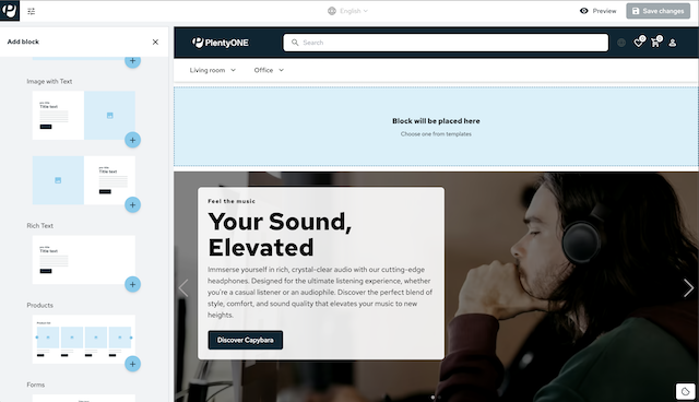
When hovering over a content block with the cursor, plus buttons (add) are displayed above and below this block, with which you can insert a new block at the respective position. Clicking one of the plus buttons opens the block selection on the left-hand side:
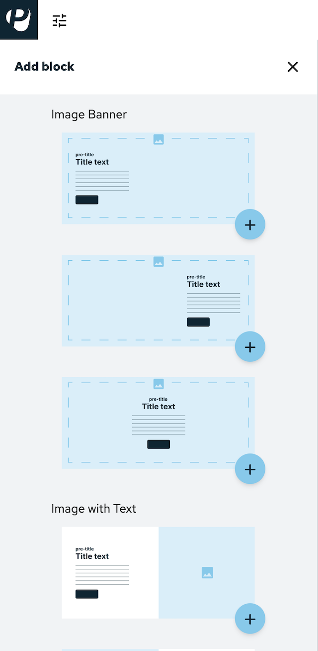
You can select from the following content blocks:
-
Image banner 1-3 (a background image with text superimposed on it in three different formats)
-
Image with text (two blocks next to each other)
-
Text (one text block without image)
-
Products (a list of items)
-
Form (e.g. newsletter registration)
Click the plus button in the bottom right-hand corner of a block to insert this block at the position at which you opened the block selection.
4.2. Moving blocks
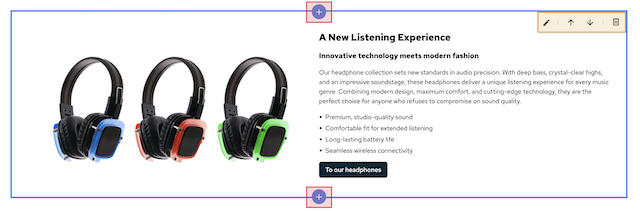
When hovering over a content block with the cursor, a UI element is displayed in the top right-hand corner. In this UI element, you will find two arrow buttons (arrow_upward and arrow_downward). If you click on one of these arrows, the block you are currently on will be positioned above or below the next content block.
4.3. Block settings
When hovering over a content block with the cursor, a UI element is displayed in the top right-hand corner.
Clicking on the pencil button (edit) opens the settings for the respective block on the right-hand side.
These settings are block-specific. They contain different options and you can carry them out per block – i.e. not globally.
The block settings have different setting sections (e.g. Image, Text and Button), which you can expand by clicking on the title of the section.
5. Overview of the various block settings
5.1. Image banner
The image banner offers an element that displays a large image, on which you can display text. You have the option to create several slides for the banner that users can switch via clicking. Add slides, carry out image settings and edit text in the block settings.
5.1.1. Editing slides
A slide is a clickable element that consists of a large image and several text elements. If an image banner block contains several slides, customers can switch between the slides by clicking on the navigation arrows on the left and right. It’s possible to carry out text and image settings for every slide separately. Select the slide you want to configure in the block settings by clicking Slide 1, Slide 2, etc:
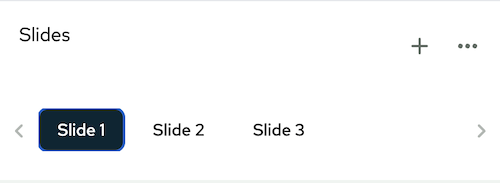
Add further slides by clicking add.
5.1.2. Arranging slides
Click more_horiz to open the context menu. In this menu you are able to rearrange, add and delete slides:
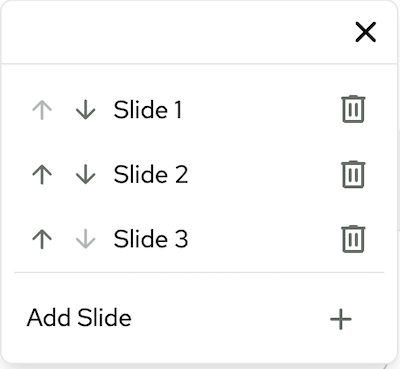
Click drag_indicator to drag a slide to a different position, displaying it earlier or later in the slide show.
Delete a slide by clicking delete in the corresponding line.
Click add to add a slide. This slide will be displayed as an empty slide as the final list entry.
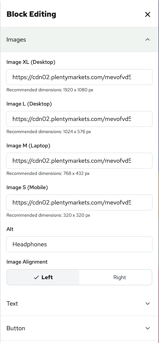
5.1.3. Image settings
You have the option to set the image settings for every slide separately.
5.1.3.1. Image sizes
There are four different input fields to provide slider images for different devices:
-
XL Desktop (recommended image size: 1920 x 1080 px)
-
L Desktop (recommended image size: 1024 x 576 px)
-
M Tablet (recommended image size: 768 x 432 px)
-
S Mobile (recommended image size; 320 x 320 px)
You save images for slides by putting the image URL (stored in the file manager for example) in the corresponding input field. All conventional formats are supported. Shop also supports modern formats, such as AVIF and WebP.
5.1.3.2. Image brightness
Use the slider to adjust the brightness of the image. Alternatively, enter a decimal number between 0,01 and 1 to adjust the brightness precisely. This setting affects all four image sizes.
5.1.3.3. Alternative text
Enter an alternative text in the Alt input field that is used for the selected image. Alternative text is an important tool to ensure the accessibility of your shop. These texts should be short and concise and not be longer than 80 to 100 characters. See our shop best practice.
5.1.4. Text settings
Enter text snippets in the text settings that are displayed in different places of the slide. There are four different text snippets (pre-title, title, subtitle and description) available. The settings for button are described further below.
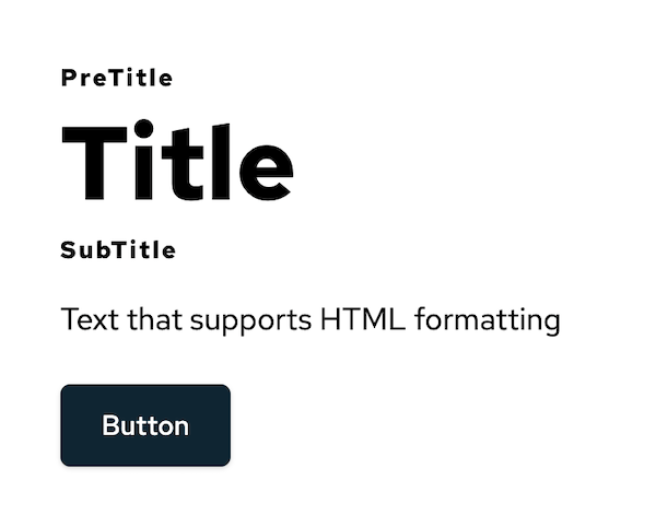
5.1.4.1. Title
The text snippets pre-title, title and subtitle are displayed one below the other on the slide. Title has a bigger font size compared to the other two. If you leave an input field empty the respective title won’t be displayed. Titles do not have a character limit. You can only enter plain text. The input fields do not support HTML formatting.
5.1.4.2. Description
Description will be displayed as normal text between subtitle and button. Contrary to the title input fields, the description input field supports HTML formatting. Descriptions do not have a character limit.
5.1.4.3. Text colour
Enter the hexadecimal code in the Text Colour input field to colour the text of the different titles and description. Alternatively, click on the coloured square on the right of the input field to open the colour selection.
5.1.4.4. Text background
Activate the Textbox Background toggle to display a coloured background in the text box and further options in the block settings.
The text box scales with the entered text.
Similar to Text Colour, you can select the colour either by entering the hexadecimal code in the Textbox Colour input field or via the colour selection.
Adjust the transparency of the text box by using the Textbox Opacity slider.
5.1.4.5. Text alignment
Select the text alignment on the slides via three alignment options.
Textbox Alignment (x) determines where on the slide along the x-axis the text box is displayed.
Textbox Alignment (y) determines where on the slide along the y-axis the text box is displayed.
Text Alignment (y) determines if the text in the text box is left-aligned, in the center or right-aligned.
5.1.5. Button settings
In the Button section, you adjust the look and functionality of the button that is on the slide.
In the Label input field, you determine the button name. If this input field is empty, no button will be displayed on the slide.
In the Link Target input field, you determine where users are redirected to, when clicking the link. Either enter the URL or provide a category path of your shop (for example: /category31/example-item_133).
In the Variant section, you determine the design of the button. Primary turns the button into the primary colour of the shop and the Label will be displayed in white. Secondary inverts the button, only the Label and frame will be displayed in the primary colour. The rest of the button will be transparent and only be coloured when hovered over.
5.1.6. Controls
In the Controls section, you determine the design of the controls on the slides. In case of the image banner this only affects the colour of the arrows, with which users switch between the slides. Enter a hexadecimal code in the Slider Controls Colour input field to colour the text of the arrows.